Enterprise is a rental car company and one of the five hundred biggest companies in the US and the world leader in rental car service.
I was the Lead Experience Design being responsible for doing UX and Visual Design for web and app in a team with other 2 UX Designers and 2 Visual designers. I was also responsible for mentoring two junior members of our team.
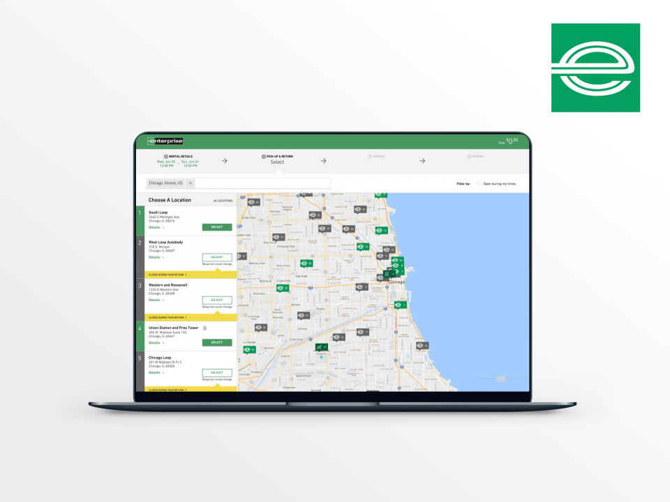
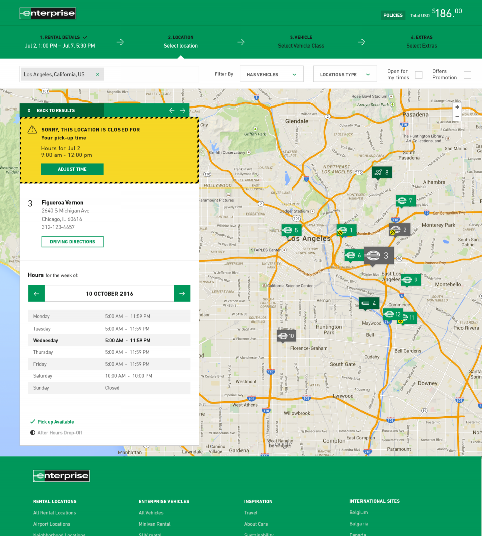
I started to take some pieces of their website to try to improve conversions, and one of the biggest user pain points that I’ve tried to amend was related to returning a vehicle when the branch is closed. The past approach was to simply say to the users to change their return hour, creating a lot of drop in the conversion rate.
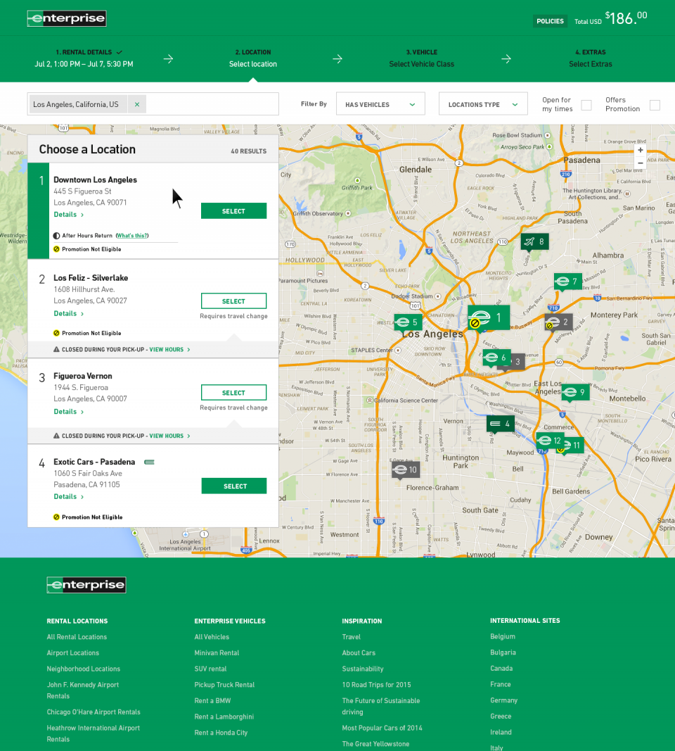
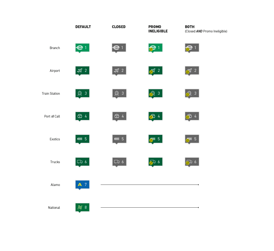
New icons to present closed branches, promo ineligible and both
I’ve worked with my team on different approaches and these versions were tested against our users for each of these ideas. Our new solution had an improvement in the conversion rate of 6%, which can in the first moment looks like something small, but when you speak of Enterprise and the massive amount of daily conversions in their website, this represents a lot of money. Also, having in mind that we are explaining to the users that they cannot complete their journey because of some problem that is client-side, and even with that keeping them going to complete their journey, is a great thing.
I also worked in other parts of the website during the six months that I was part of their team like the pay now / pay later option (which combined with a price reduction for the pay now option increased the number of bookings), the updated search component and the new reserve screen, which all of them have been tested and have presented an increase of conversions and better perceptions by our users.
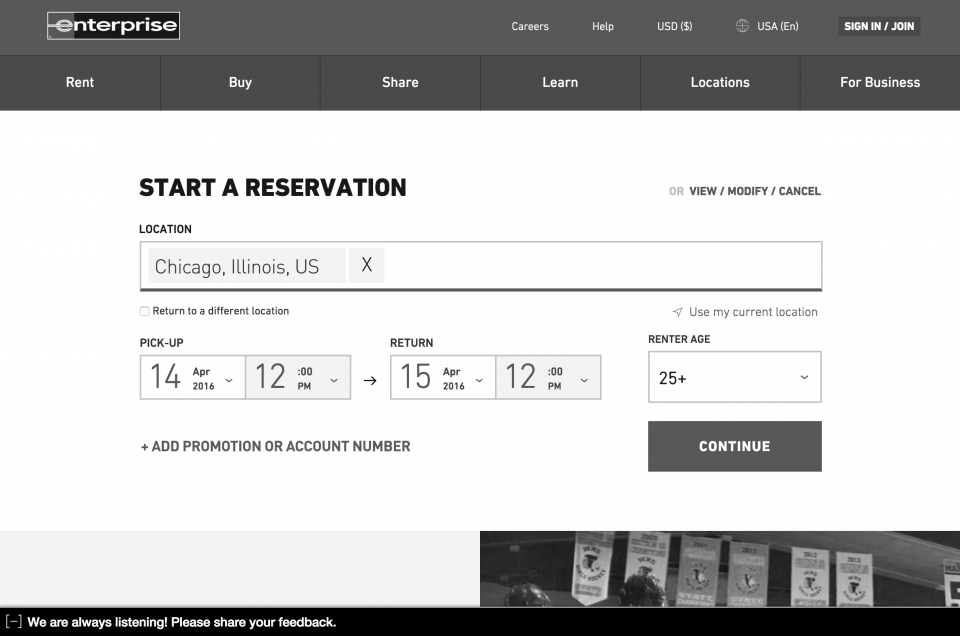
Booking widget clean up – wireframe
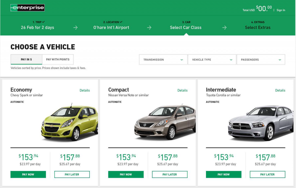
Pay later functionality study