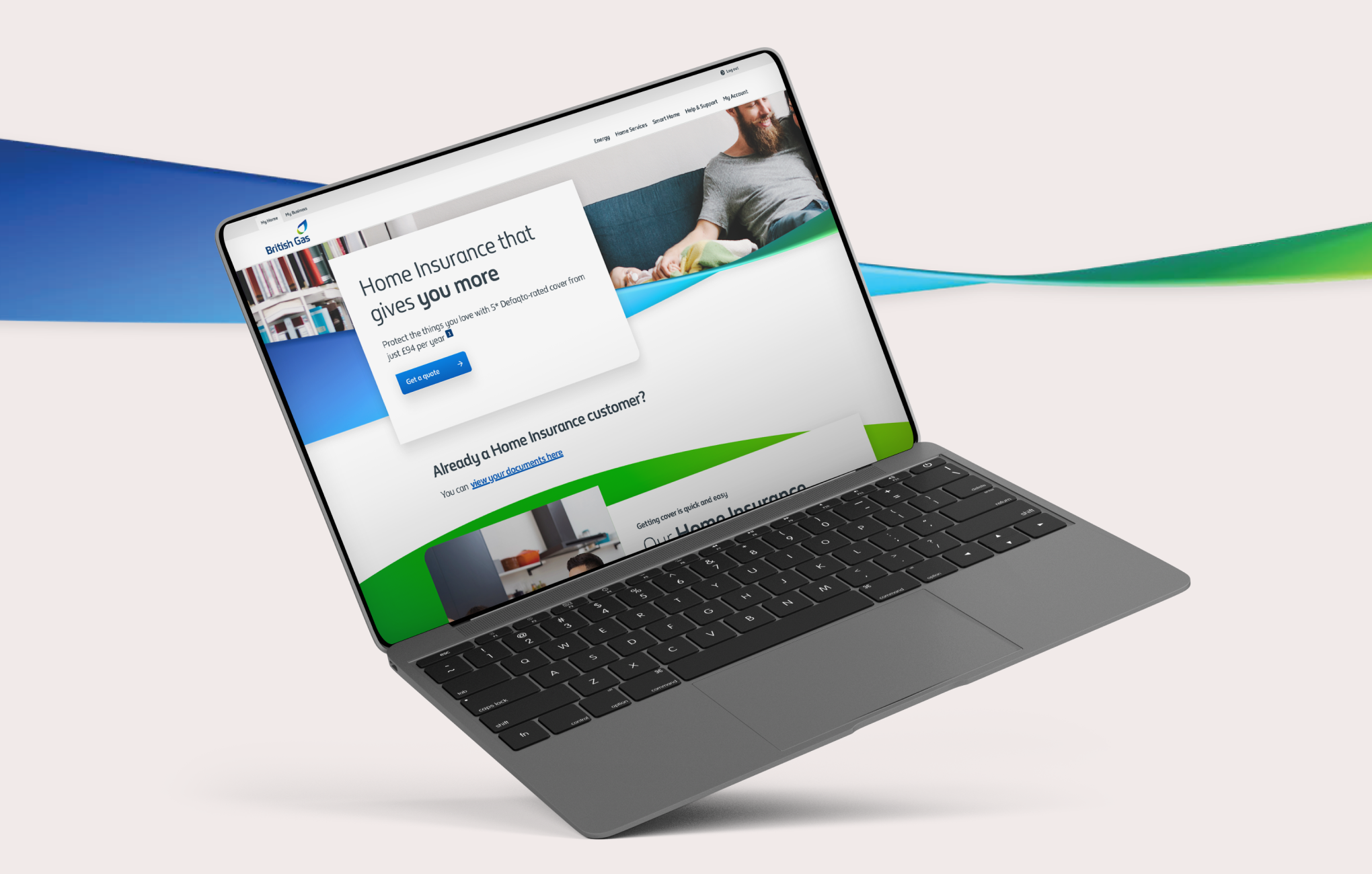
Lead UX Designer, contract. Six months from launch to every two-year KPI.
Client
British Gas
Role
Lead UX Designer (Contract)
Timeline
2018 - 2019
Outcome
25% conversion vs 12% avg
By the numbers
25%Conversion, against a 12% average
~3xThe old third-party model’s conversion
6Months to every two-year KPI
+2%From one change nobody saw in the data
TL;DR
I was brought in to build a connected-home product, ended up building Home Insurance instead, and it became the fastest-growing venture British Gas had launched. We hit every two-year KPI in six months and held a 25% conversion rate against the 12% that price-comparison sites average.
The lesson that got us there was counterintuitive: people didn’t want the quick, cheap quote. They wanted the long one.
And the research habits I built proving things like that are the same ones I carried into Uptime years later.
Key successes
Four results
1The only designer on the productDiscovery, research, UX and UI, with one PO, one BA, a scrum master, devs and testers
25%Converted at 25% against a 12% averageThe average for price-comparison sites
6Every two-year KPI in six monthsConverting at roughly three times the old third-party model
+2%Found the fix nobody saw in the dataLetting real users correct what we’d assumed about their home
British Gas sold energy. The bet was that the brand’s trust could carry it into services people don’t associate it with, taking Home Insurance off the old third-party model.
User problem
A quote is only worth trusting if it feels like it reflects your home, your situation, your risk, not a generic number.
The brief
Hired for something else
The original brief was Home IQ, a blend of insurance and preventive home services. I ran the discovery with the team, it tested well, and then it got handed to the Hive team who already owned connected devices. Fair call, wrong home for me. Oliver, the other UX designer, moved on to another team, and I was handed Home Insurance to build.
I was the only designer on it: one PO, one BA, a scrum master, a couple of devs and testers, and me running discovery, research, UX and UI.
The playbook
Make it fast
I knew how everyone else in this space operated, and I knew the British Gas brand carried trust, so my first instinct was the obvious one: make the quote journey fast. Fewer questions, quicker price, less friction. Standard playbook.
It tested worse than expected. Badly, even.
What I saw
Length read as care
What I found watching participants was the opposite of the playbook. Even when the quick quote came back cheaper, people preferred the long one. The extra questions made them feel the quote actually reflected their home, their situation, their risk, not a generic number.
Speed read as carelessness. Length read as care.
The call
Questions the back-end didn’t need
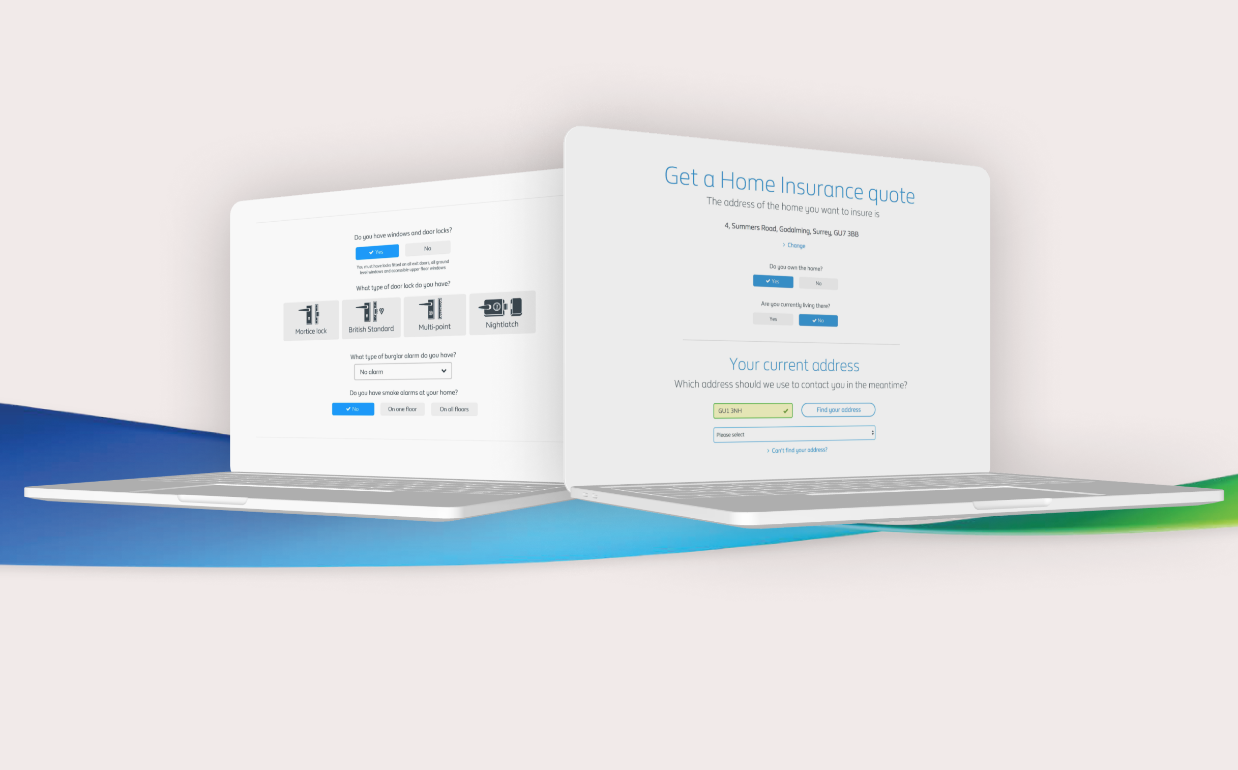
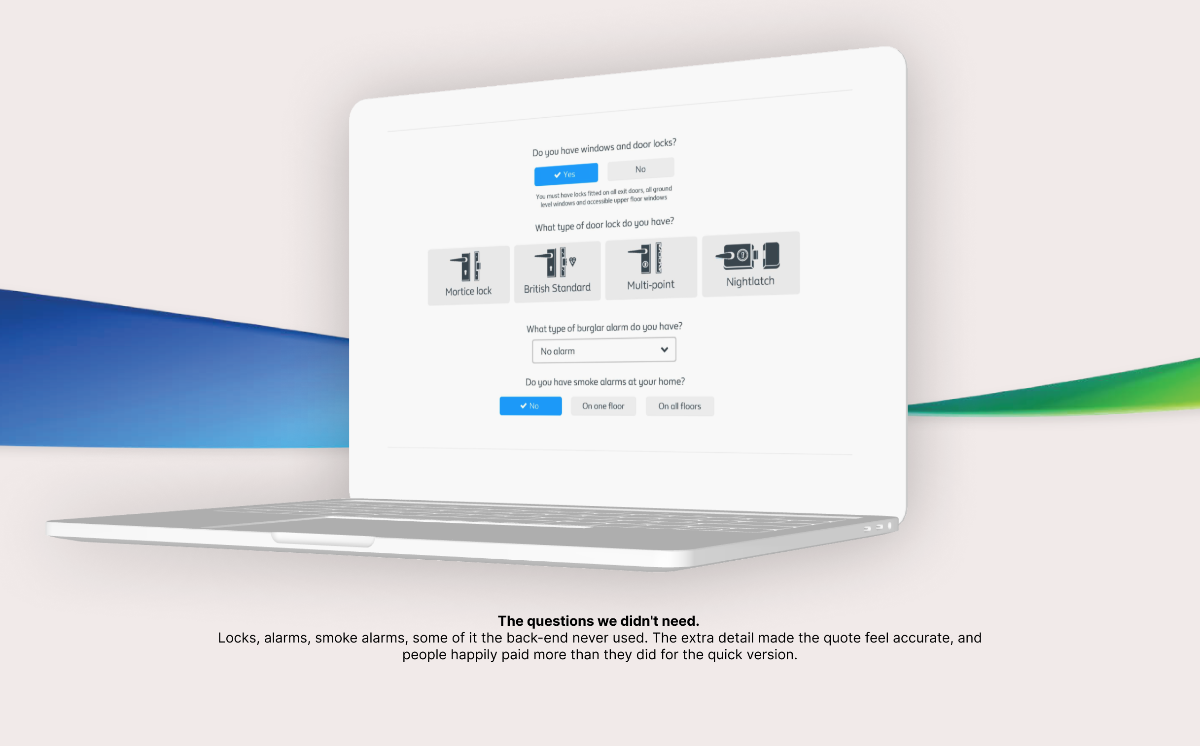
So I did something that looks wrong on paper. We added questions the back-end didn’t even need, purely so the journey felt thorough enough to be trusted.
The friction wasn’t the enemy. The right friction was the product.
How I actually knew
Business problem
Every design decision needed proof, not a hunch, and research couldn’t be a bottleneck that lived with one designer.
User problem
What people say, what they do and what the analytics show rarely agree.
The method
Every decision a hypothesis
None of that was a hunch I got lucky on. This is the project where I built the way I run research, and it’s the part of British Gas I carried furthest.
Quick quote versus long quote wasn’t a debate, it was a test, run with real participants, with the cheaper option deliberately on the table so a preference for length couldn’t be explained away by price.
01What people saidSessions, run constantly
02What they didLive usage, watched as it happened
03What the analytics showedConversion and friction, tracked in Adobe Analytics
Those three rarely agree, and the gap between them is usually where the insight is hiding.
The team
Research anyone could run
The bigger thing was making research something the whole team could do, not a bottleneck that lived with me. I built a repeatable way to frame a question, get in front of users quickly, and come back with an answer everyone could act on.
That process is the one I later brought to Uptime, where several people picked it up and ran their own research the same way.
British Gas is where it was forged.
The 2%
What nobody could see in the data
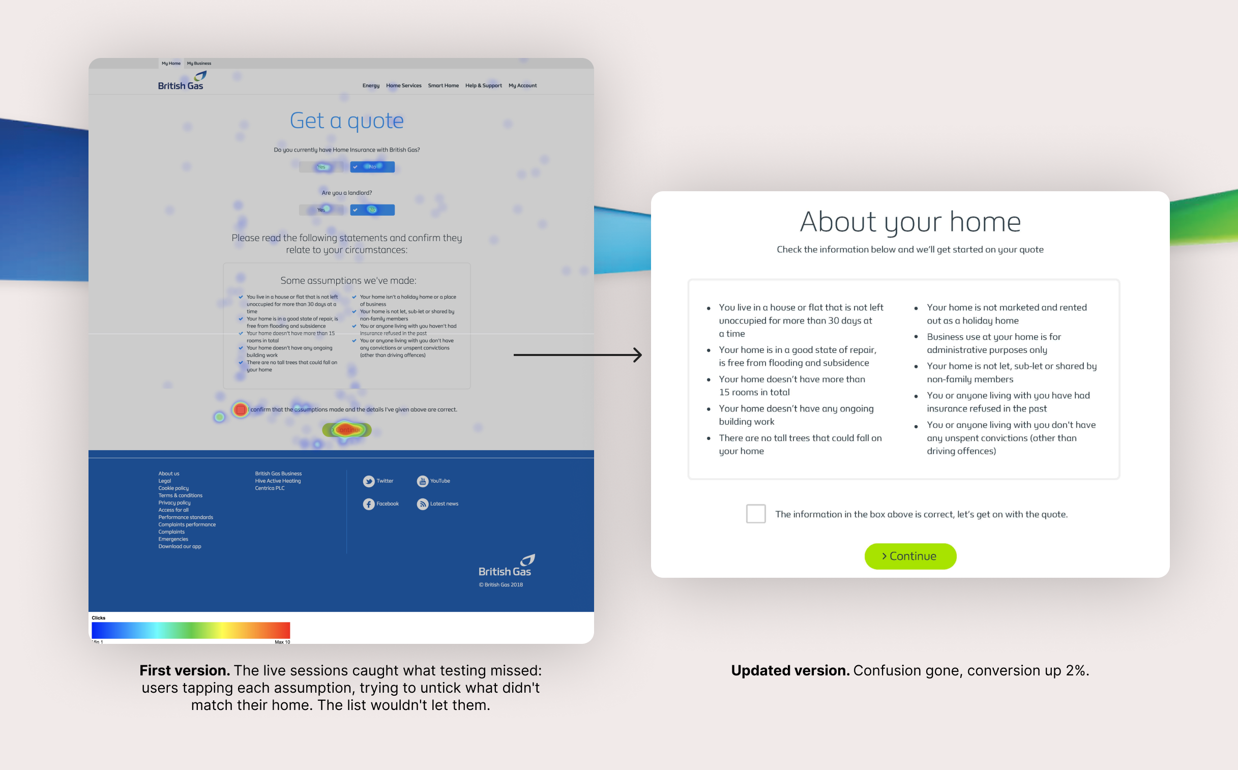
The clearest proof of why I watch real usage came late. Something that never showed up in a single user test and never surfaced in the analytics: live, real users were trying to untick items on the assumptions list, the “we’ve assumed these things about your home” step. They wanted to correct it, and the design wasn’t letting them.
We let them. That one change added another 2% to conversion.
The behaviour only appeared when the stakes were real and nobody was performing for a facilitator.
Where it landed
Every two-year KPI in six months, converting at roughly three times the old third-party model it replaced.
The result
25% against a 12% average
BRITISH GAS25%
MARKET AVG12%
Conversion rate, against the price-comparison site average
This was a big one, for British Gas and for me. I ran it solo through the month before launch and its first stretch live, using Adobe Analytics to track conversion and friction and live sessions to catch what the data couldn’t.
Built by trusting what people actually do over what the playbook says they should.