Uptime App
The bite-sized learning app. Head of Product Design, seven years. Built it 0 to 1, took it from a B2C app to a B2B platform, led a team of 8. Hands-on the whole way: senior IC craft, team leadership, and a founder's remit across product, proposition and growth.
TL;DR
I joined when Uptime was an idea about cutting the best moments out of internet videos and stitch it into expert led playlists. The pivot to book summaries put us late into a crowded market where everything was text or audio, formats that assume you'll concentrate when real people skim, drift and forget. The visual Hack format Jean Cambruzzi and I created solved both problems at once: users finally retained what they learned, and Uptime finally had a reason to exist.
We'd grown to millions of learners, raised serious funding, landed enterprise clients, and turned a consumer habit app into a platform businesses pay for. Three remits at once: Head of design for the product team, product lead for Proposition, and oversight of Growth.
Key successes
• Invented the visual Hack format with Jean Cambruzzi, roughly 3x more engaging, and turned the a-ha moment it created into our north-star metric • Built Spark and Spark Repetition into a retention engine: 1.6x Day 1, close to 4x Day 7, around 5x app usage for engaged users • Won the argument for a bold redesign with evidence, not opinion; Apple, Google and Fast Company recognition followed • Drove monetisation strategy with Christian Vasile and Léa Samrani: 100+ A/B tests across paywalls, onboarding and first-Hack journeys, including proof that our free trial was losing us money • Designed Hackbot and the enterprise layer behind the B2C to B2B shift: Optum, State Street, 2,000+ enterprise customers • Grew the product design team from 2 to 7 and led 8 across product
The shift that changed the product
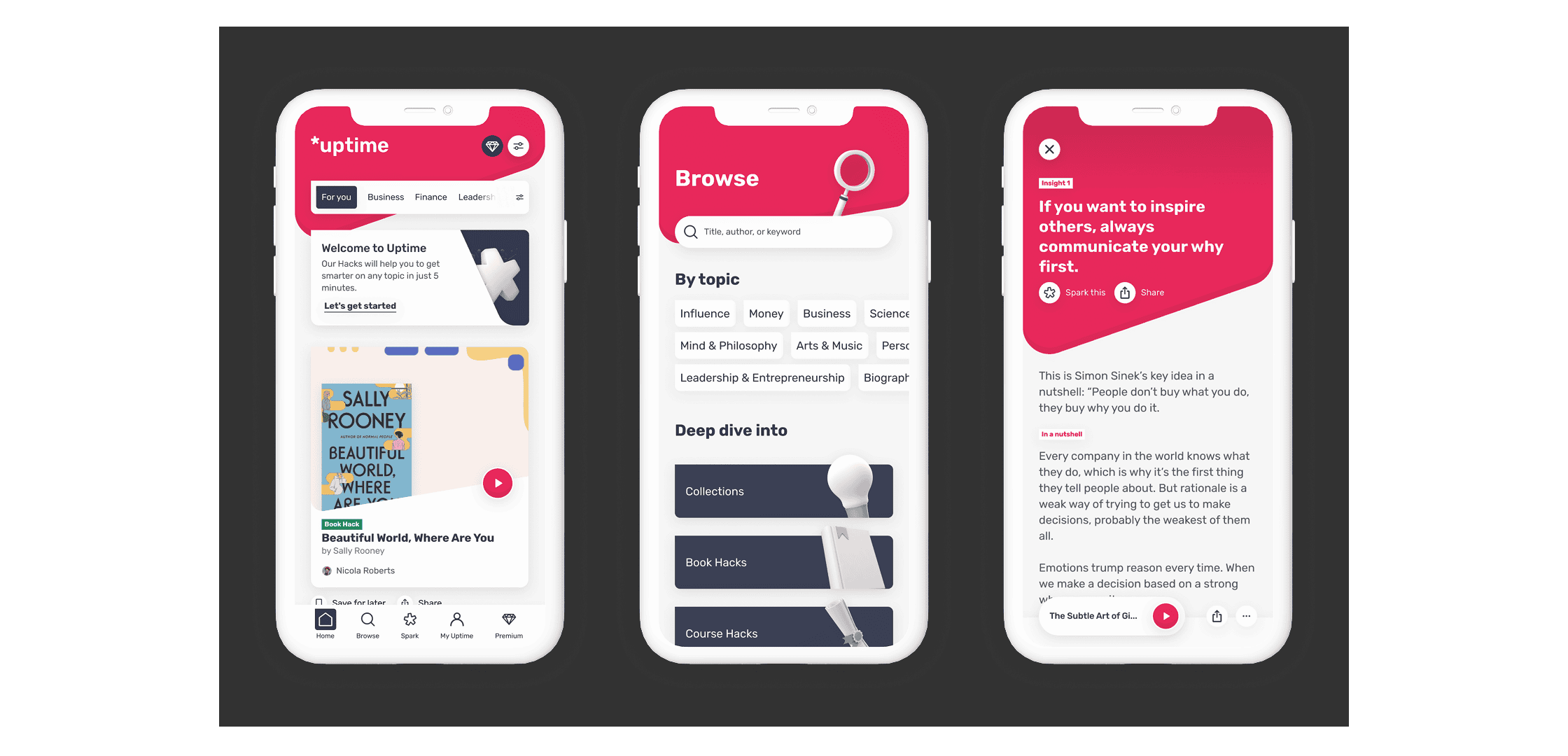
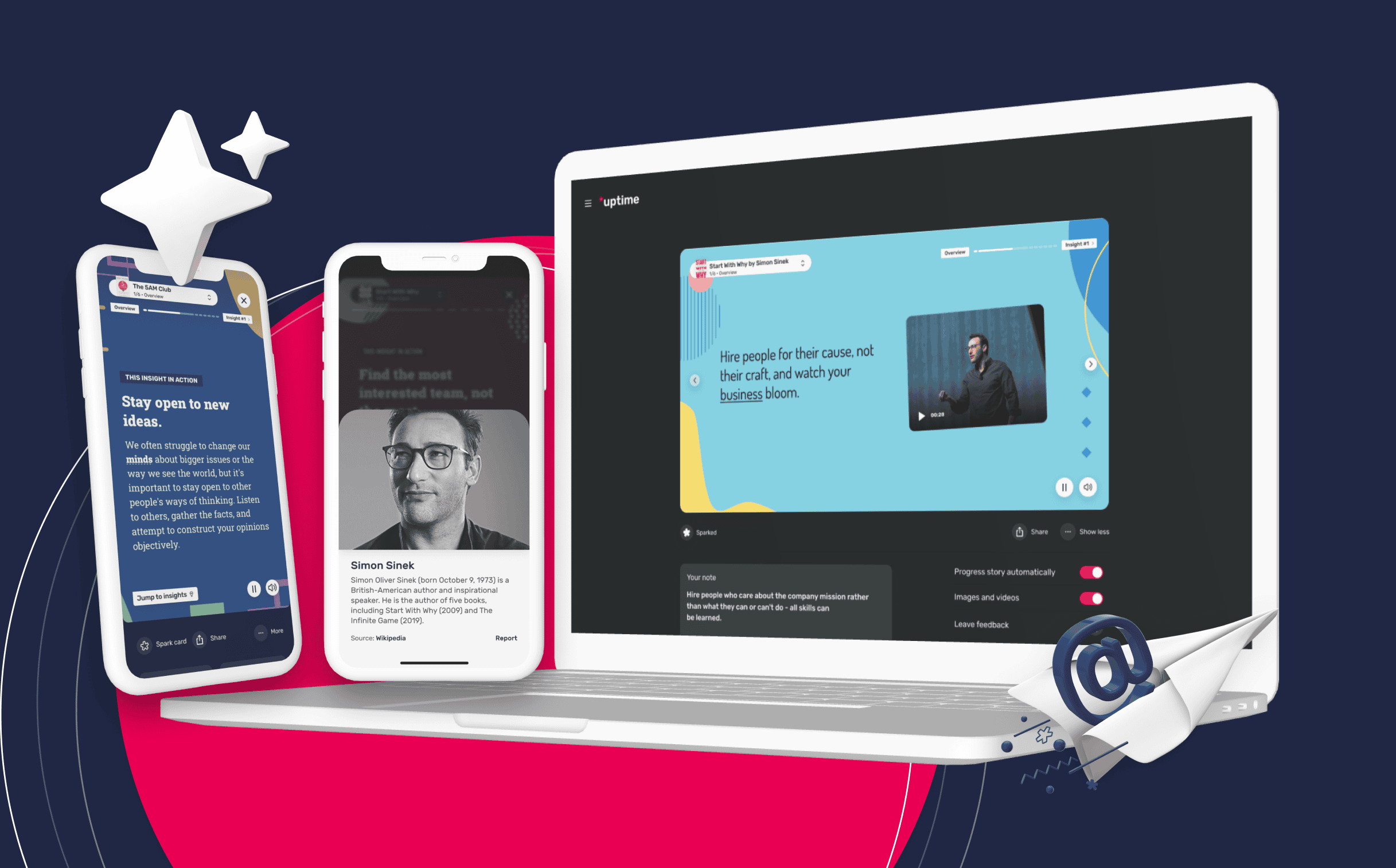
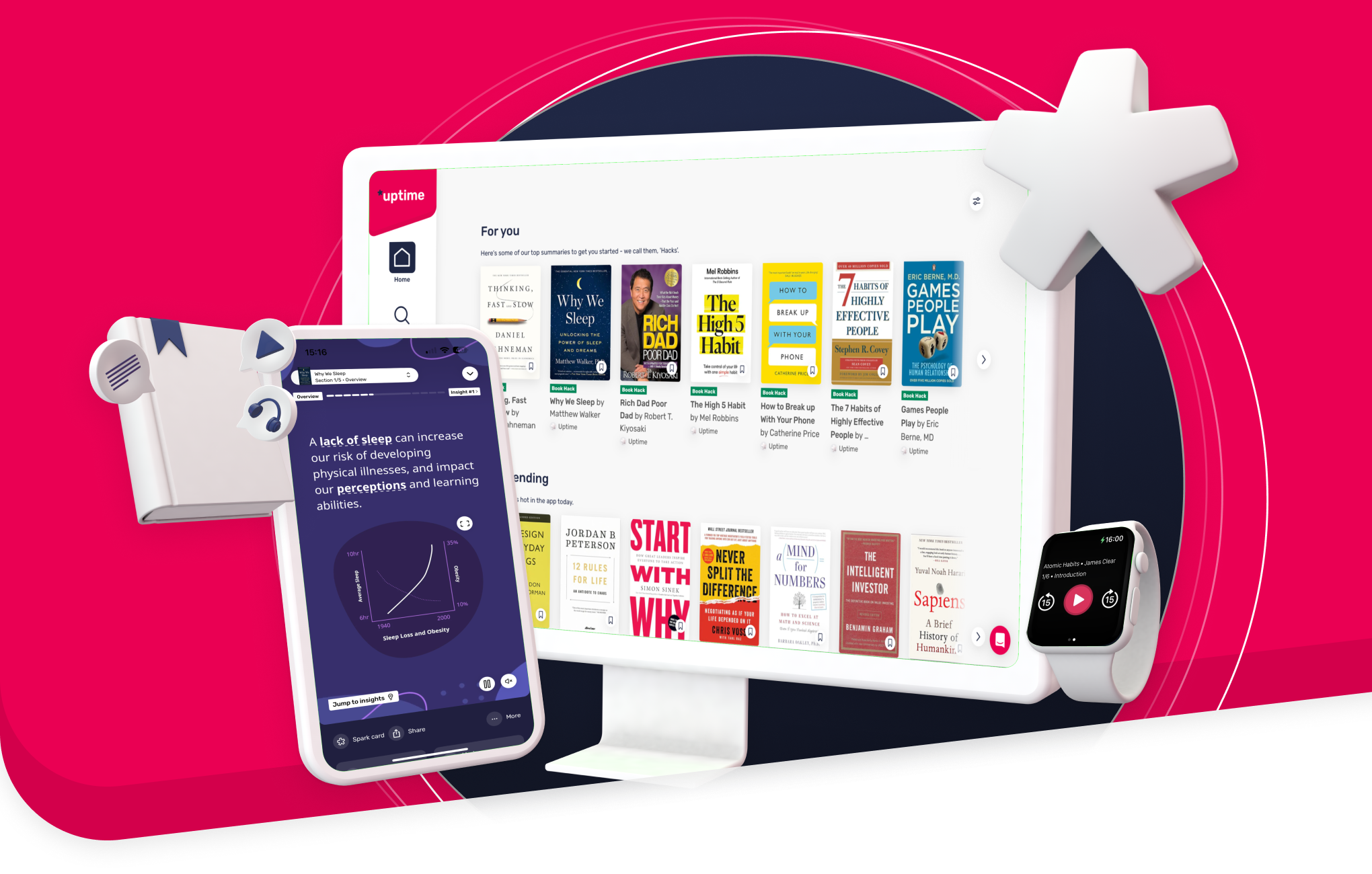
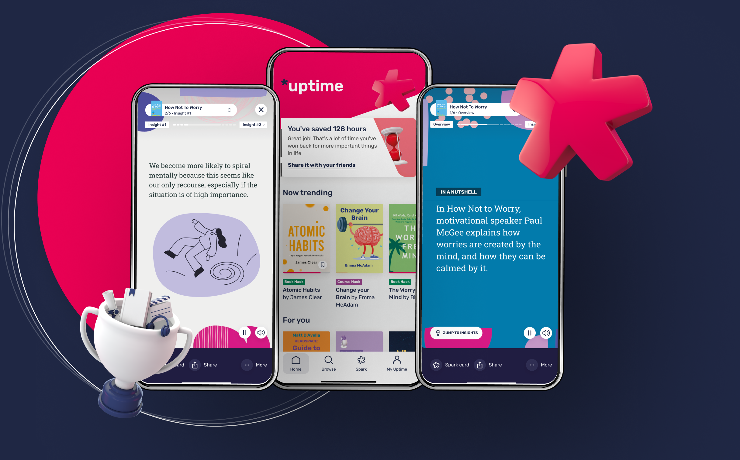
The original Uptime was video, stitched into expert playlists that helped you learn new concepts. Expensive to scale, and we stopped it during COVID. We pivoted to books, courses and documentaries, but by then we were late next to Headway and Blinkist. We needed a reason to exist. That reason became the visual summary. The market served learning in two ways, text to read or audio to play, and both assume you'll concentrate. Real people skim, drift and forget. So I took my own visual and presentation style, with animations, and turned a Hack into something closer to an Instagram story with meaning: intro, three insights, in action, a conclusion, carried by audio, visuals and text together, grounded in the science of how people actually learn and retain. Jean Cambruzzi and I shaped the format together; I drew it and built the visual execution. We didn't bet the company on taste. All three formats shipped, and we validated the story format cheaply, acquired content and freelance illustrators on the top-tier Hacks only, so we could learn without building a content factory first. The data came back roughly 3x more engaging, so we changed the default, absorbed audio into story mode, and kept text. Changed the default, removed nothing. It tested well, but the real signal came later. People were sticking the moment they opened their first Hack. That was the a-ha: open one, and you instantly got what Uptime was for. The format did the explaining that a description never could. That's the moment Uptime went from a loose concept to a product people understood, structure where there hadn't been any. "Hack opened" became our north-star metric, and we optimised hard against it.
But it only worked as a metric because the format underneath was sticking: you can optimise a funnel all day, it won't hold anyone if the thing at the end doesn't land. This one did.
The visual: fixing what people felt before what they did
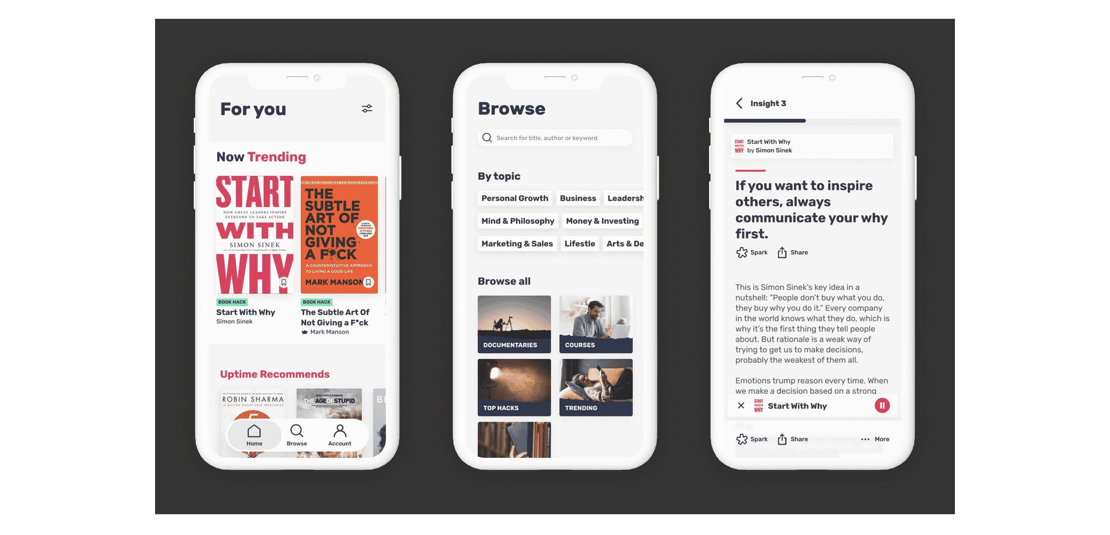
The initial UI tested as generic. People couldn't tell us what Uptime was for by looking at it, and in a category where every product looks the same, looking the same is a decision too, just a bad one. So I set a design principle the whole team could build against: we hide with shapes to reveal effortless knowledge. We went bold on purpose, challenger-brand thinking, the Monzo and Airbnb playbook of getting loud for awareness, then settling. Not everyone agreed, including at the top, and dev teams have every right to be wary of big-bang rebuilds. So I built evidence. We tested it properly: 28 people, UK and US, 14 on the old design and 14 on the new, unmoderated, same questions, so nobody could say the test was leading. The old one came back generic and busy. The new one came back Fun, Curious, Energetic, Friendly, the exact personality we were aiming for. Hard to argue with users agreeing with each other. For the build, a POC first so the direction was tangible, then an explicit promise: this is where we're going, but you won't see it in one go. We rolled out in phases and kept the lights on alongside. This was also when we brought the app to life with micro-interactions and animations, the small moments that make something feel considered rather than functional. That's the difference between an app you use and one you actually like opening.
The bet paid off. The new look made us stand out instead of blending into the category, it pulled in millions of downloads, and it earned recognition from Apple for the visuals. The recognition kept coming: App of the Day and Apps We Love 2021 from Apple, Best New Apps of 2021 from Fast Company, App of the Year 2021 from Google. Awards are nice, but the reason they mattered comes later: you can't sell a learning product to a company by promising employees will enjoy it. You have to have already proven they do. We had.
Spark: retention, found through a failure
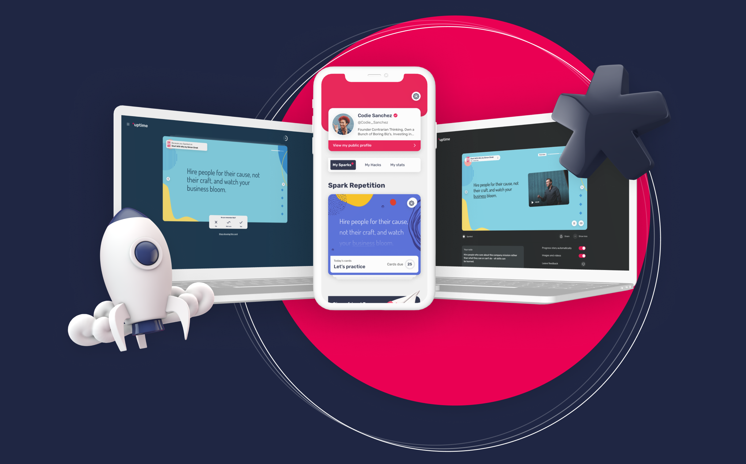
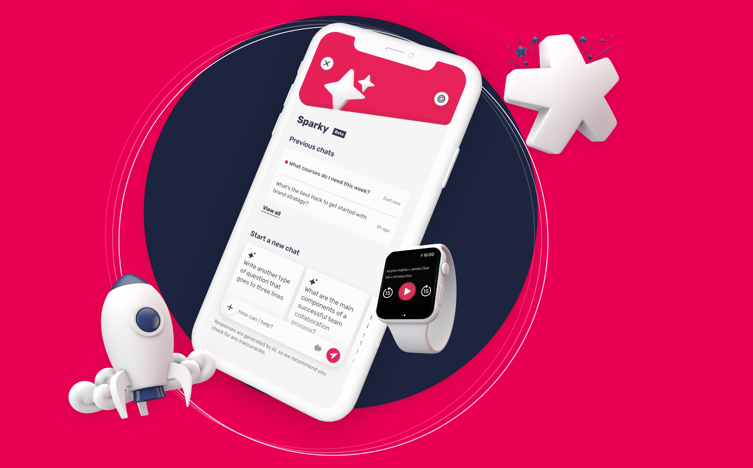
Before Spark, there were streaks. Founders and investors wanted daily usage, Duolingo had made streaks the industry's answer to retention, and they wanted ours. I raised my concern, a language lesson is a snack, learning from a book summary is a meal, and people don't eat meals on a streak schedule, but a concern isn't data, so we built it properly and gave it a real shot. Streaks moved nothing. Retention didn't shift. And buried in that failure was the actual insight: our users came back weekly, not daily, and that wasn't a motivation problem, it was the natural cadence of real learning. Instead of fighting the behaviour, we built for it. The behavioural truth I kept coming back to: when someone reacts to content they genuinely believe in, they start building their own space on Uptime, a knowledge chest. It's the "like on Facebook" moment. Once it's yours, you come back. Spark let people save the insights they believed in. I led the Proposition team, wearing the PM hat and the design hat at once, designed the first versions, and the team took them forward. The numbers held up: • Sparking lifted Day 1 retention by 1.6x • Day 2–3 retention roughly 2x • Day 7 retention close to 4x Then Spark Repetition, spaced repetition built on top of Spark and grounded in the same learning science as the format itself, brought engaged users back on the weekly rhythm that was ours all along: around 5x the app usage, against one of the most important KPIs we had.
A failed test that teaches you your product's real rhythm is worth more than a successful one that flatters the roadmap.
The money side: testing the defaults
Monetisation at Uptime wasn't a solo effort. I worked on it alongside Christian Vasile, Senior Product Designer, and Léa Samrani, Lead Product Manager, and together we treated it like any other design problem: instrument the whole chain from trial started to renewal, set guardrails, test everything. And we tested everything. More than 100 A/B tests over the years, alongside user testing and everything in between, and not just paywalls: onboarding journeys, the paths that get users to open their first Hack, plan structures, pricing. The optimised version people saw was the survivor of a very long tournament. The biggest finding was counterintuitive. Every subscription app runs a free trial, so we tested whether the default was actually true for us. It wasn't. The trial converted worse than asking for payment upfront, the payers it produced cancelled more in their first week, and revenue per signed-up user fell by roughly a quarter. It was manufacturing weak commitments, people who'd tapped "free" and never really decided to pay. We killed it. A later variant taught us something subtler. It won over 3x more card commitments, a clear success on the money dashboard, but the guardrails showed it quietly stealing users from opening their first Hack, the a-ha moment the whole product depends on.
We designed the metric set for exactly that trap: money metrics on one side, first-Hack and first-Insight metrics on the other. Monetisation was never allowed to win by cannibalising the product.
From a loved app to a product businesses buy
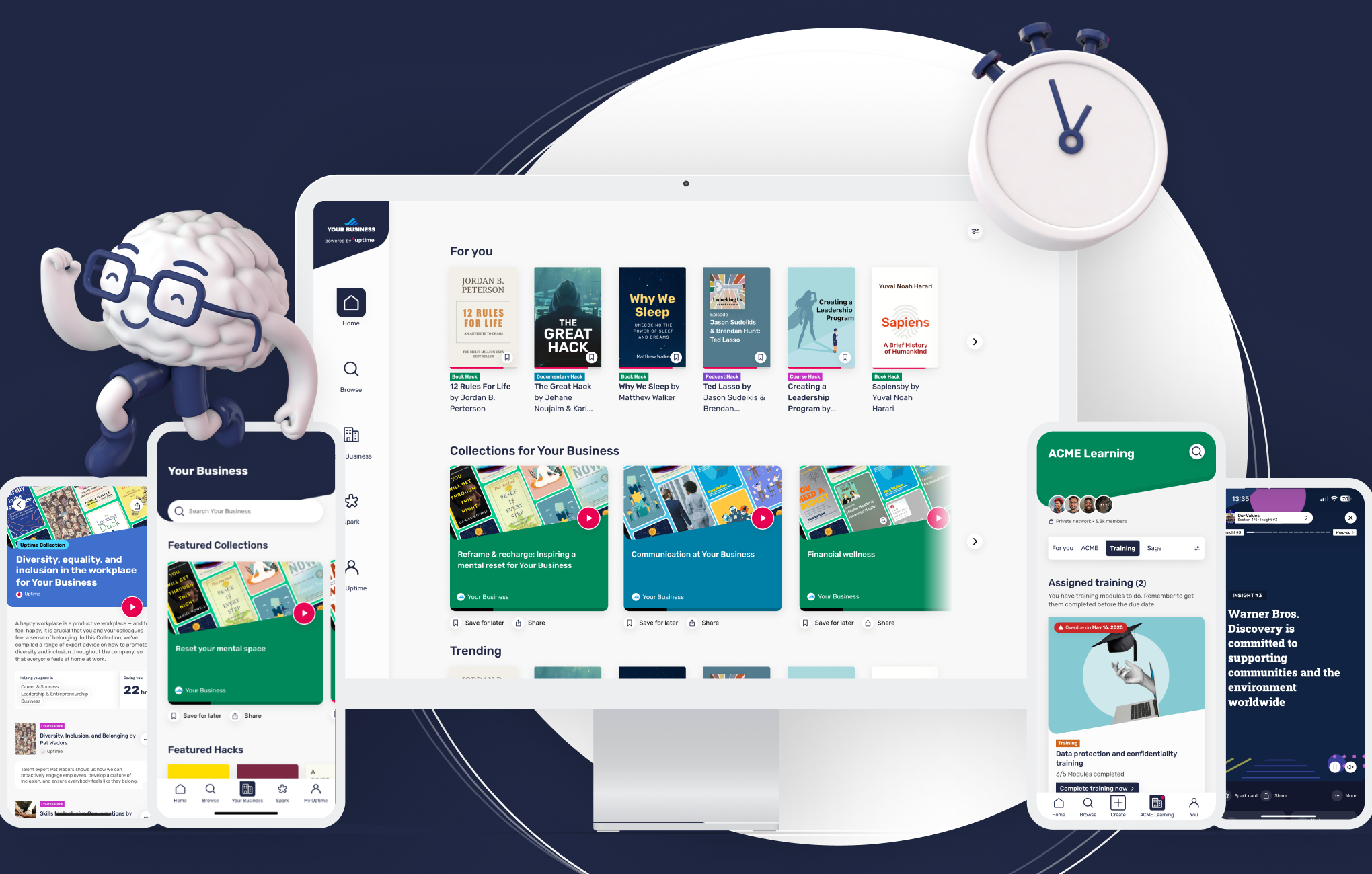
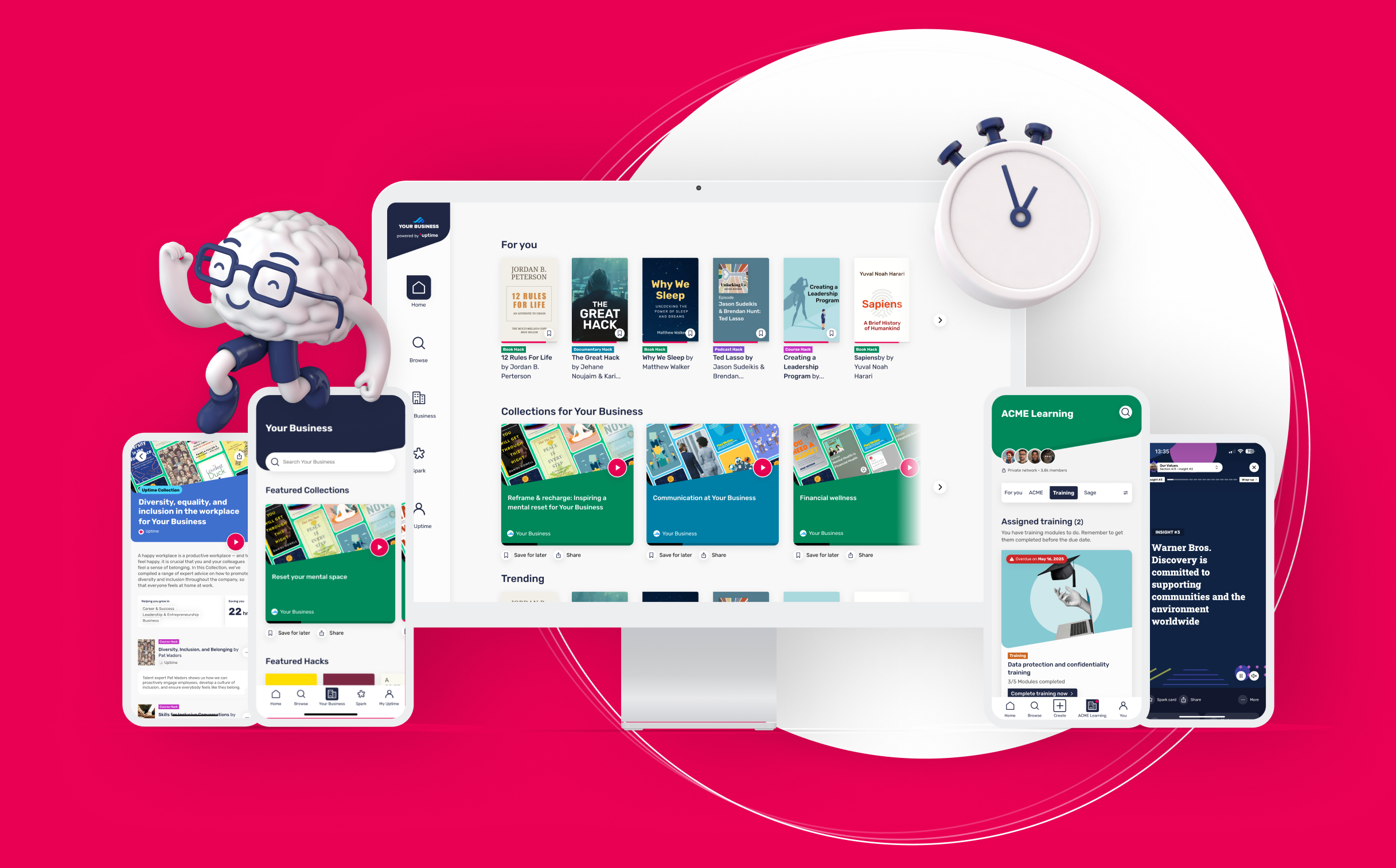
This is the shift I'm proudest of at a company level, because most consumer apps can't make it. The usual story for a B2B learning product is grim: a company buys an LMS, employees ignore it, and "completion" becomes a box-ticking exercise nobody enjoys. We were coming at it from the opposite direction. We had an app people genuinely liked using, awards and all, and the question was whether that affection could become something a business would pay for across thousands of employees. The key call was structural, and I'll take no credit for inventing it but plenty for building toward it: we stopped treating B2C and B2B as two products. There was one platform. B2B became a way of distributing it, not a separate thing to maintain. That decision is what kept it sane. No bespoke builds per client, the same product everyone already loved, just with the layer a company needs wrapped around it. That layer is where my work went. Single sign-on and a secure company network. The ability for a business to take its own training, onboarding, wellbeing, or compliance material and turn it into the same five-minute format people already came back for, which is exactly what Hackbot unlocked. Branded spaces, content split by team, reporting so an L&D lead could see what was actually landing. Twenty-four languages so a global workforce wasn't an afterthought. The pitch to a buyer wasn't "here's another tool." It was "replace the stack of things your employees avoid with the one thing they already open." The consumer awards did the hard part of that argument before we said a word.
It worked. Uptime went from a B2C app into enterprises like Optum and State Street, used for everything from compliance to wellbeing to internal comms, the same Hack format carrying all of it.
Hackbot: pragmatic AI that keeps the human in charge
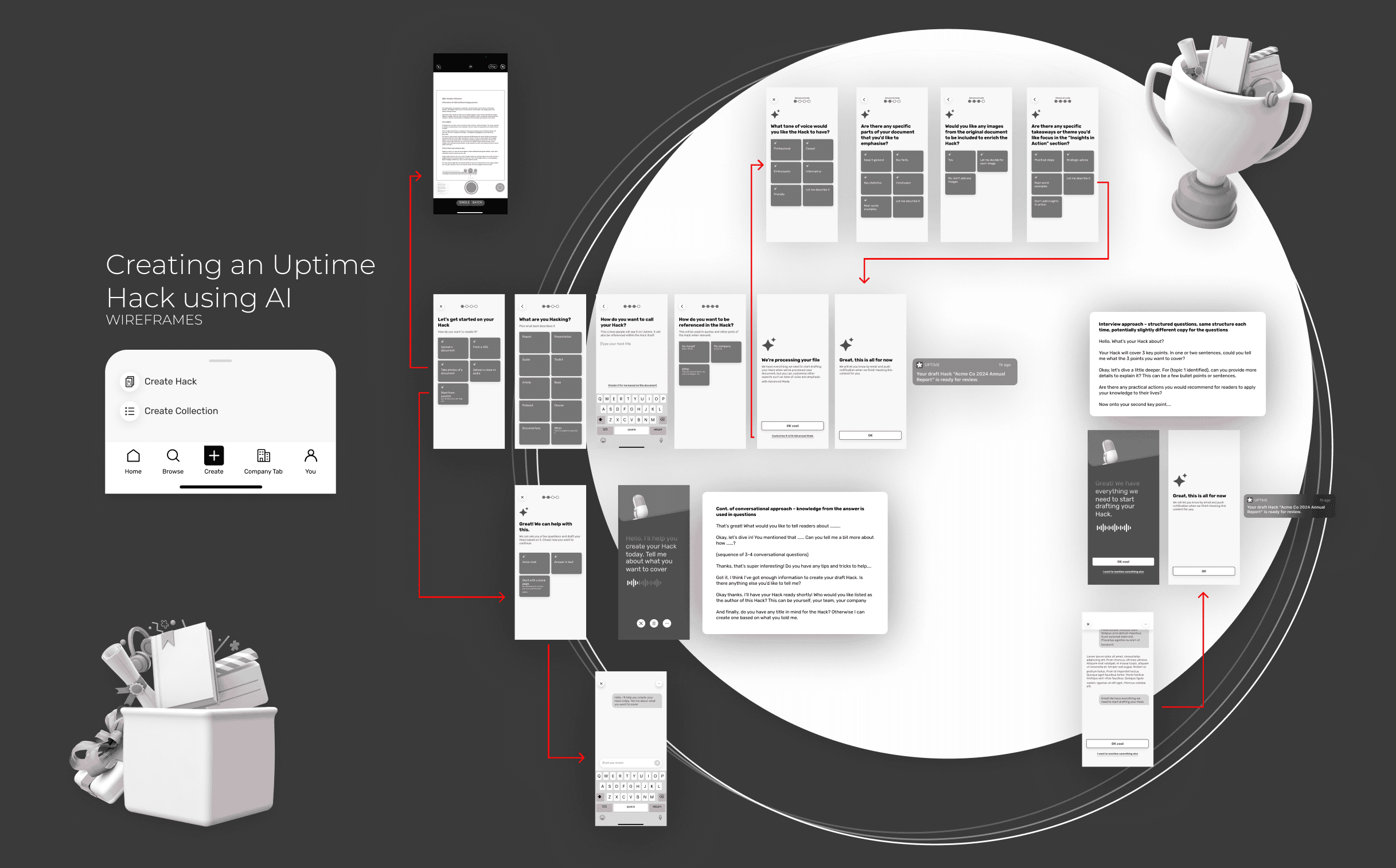
This is the B2B turning point. Drop in a document, a URL, a video or some audio, and the system drafts a Hack in the Uptime format. My job was the flow, not the magic. Two routes, by design. Create it for me does the heavy lifting. Or a guided Q&A, voice or text, walks you through point by point: tell me what you want to cover, then for each key point, the detail and the practical actions a reader could apply. That maps straight onto Insights and Insights in Action. The principle was lower the floor, don't lower the ceiling. Simple by default, with an Advanced Mode for power users to tune tone of voice, emphasis, whether to pull source images, and where to point the Insights in Action. And the output is always a draft for review, never auto-published. The human stays in control. Then publishing controls and auto-translation into 23+ languages.
Hackbot is where business content becomes something people actually want to learn from, it brings legacy content to life, and it's the moment a business becomes a customer.
Where it landed
Millions of learners. Tens of millions invested. Two thousand plus enterprise customers.
There's more from where this came from
Seven years is a lot to fit on one page. I've left out at least as much as I've put in: the user acquisition and growth experiments, the research framework I set up so the whole team could run their own studies, and the constant optimisation that keeps a product alive once it's launched. Some of the most useful work lately has been in how I use AI in my own process. AI still can't design a large, living library on its own, but with a solid design.md as the source of truth it can get me a long way: I use it to generate references and rough first passes, then take those to a finished state myself. It speeds the early part up without pretending it can do the part that still needs a designer's hands. Same with research, faster to set up and sift through, with me still making the calls. The principle is the one behind Hackbot: let AI lower the floor, never let it take the human out of the decision.
Across seven years I've had a hand in the strategy, the marketing, the acquisition, the monetisation and the optimisation, not just the design. That breadth is the thing I'd most want to talk through in person, because it's the part a portfolio page can't really hold.