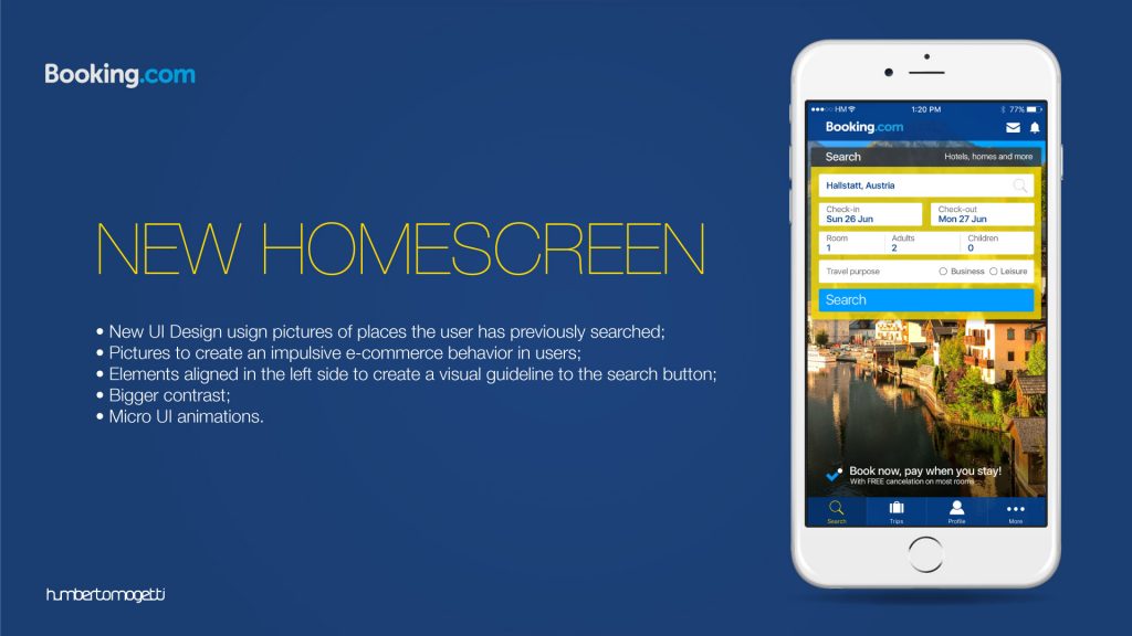
Booking Homescreen
This is the first and most complicated item to change because I am changing the element with the biggest memory for the users, but I believe that I have a chance to create something here to improve conversions even without having access to the analytics numbers… My idea here is to create a home screen with pictures of places the user has previously searched. I am using pictures to create an impulsive e-commerce behavior in users. So, if the user was in doubt to book a place for his next trip, what could be better than seeing what he is losing? Besides that, I put all elements aligned in the left side to create a visual guideline to the search button. I changed the interface using bigger contrasts but I have tried to maintain the user memories here with the same colors and everything else. I know that Booking is the #3 e-commerce in the world and I am not trying to reinvent the wheel here, and I also know that we will not have a picture for every city in the world, so in certain cases we will need to show pictures from the state or country, but in my idea we will cover the capitals and biggest cities for tourism in the world.
https://www.youtube.com/watch?v=Z18g8GPQa8c
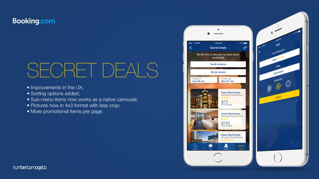
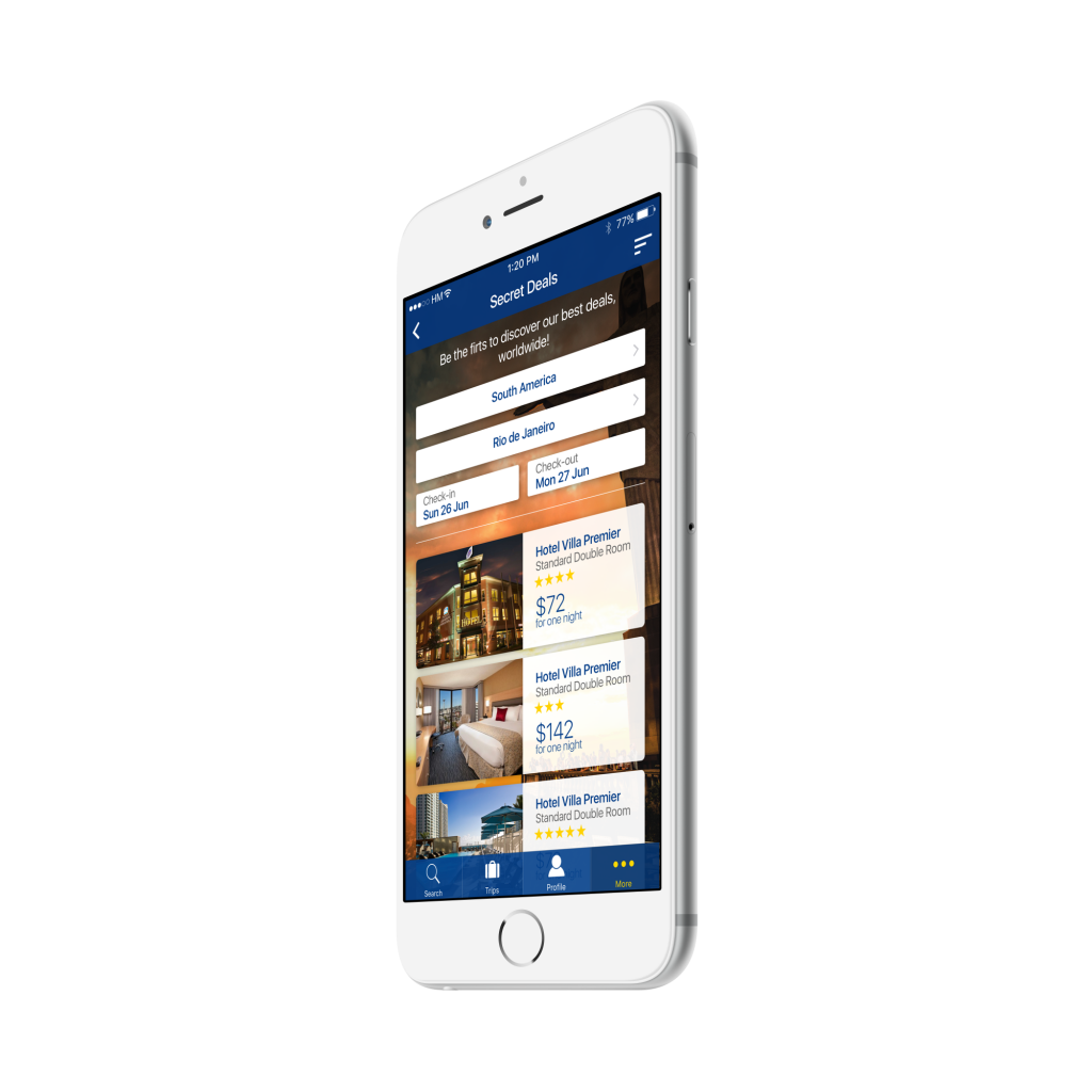
Booking Secret Deals
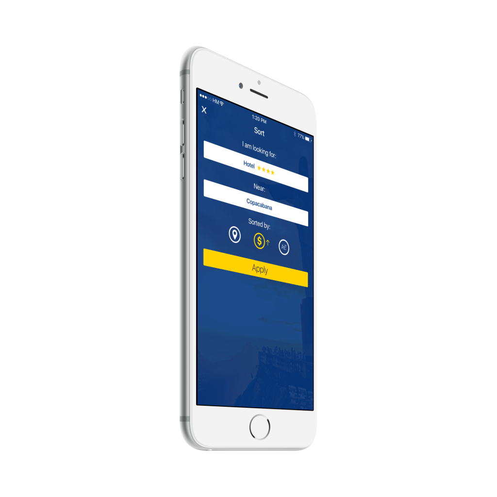
In this area I found some improvements in the ux that could be done. The first one is the absence of sorting options (here in Brazil we always love to search things from the lower to the highest price for example). Besides that, the selection of the items using a sub-menu interface with very close sub-items makes the tap almost impossible, even on a iPhone 6 Plus. And the last improvement is changing the items on the list, using pictures with a 4×3 format (unlike the square actual format) giving the opportunity to the hotel owners to show more and without a crop in the pictures… I saw that you have A-B test results that shows no difference in conversion numbers using bigger or smaller pictures, but with this I am showing more items per page for the users with the same visual appeal.
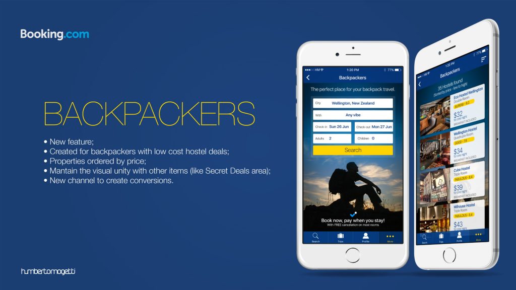
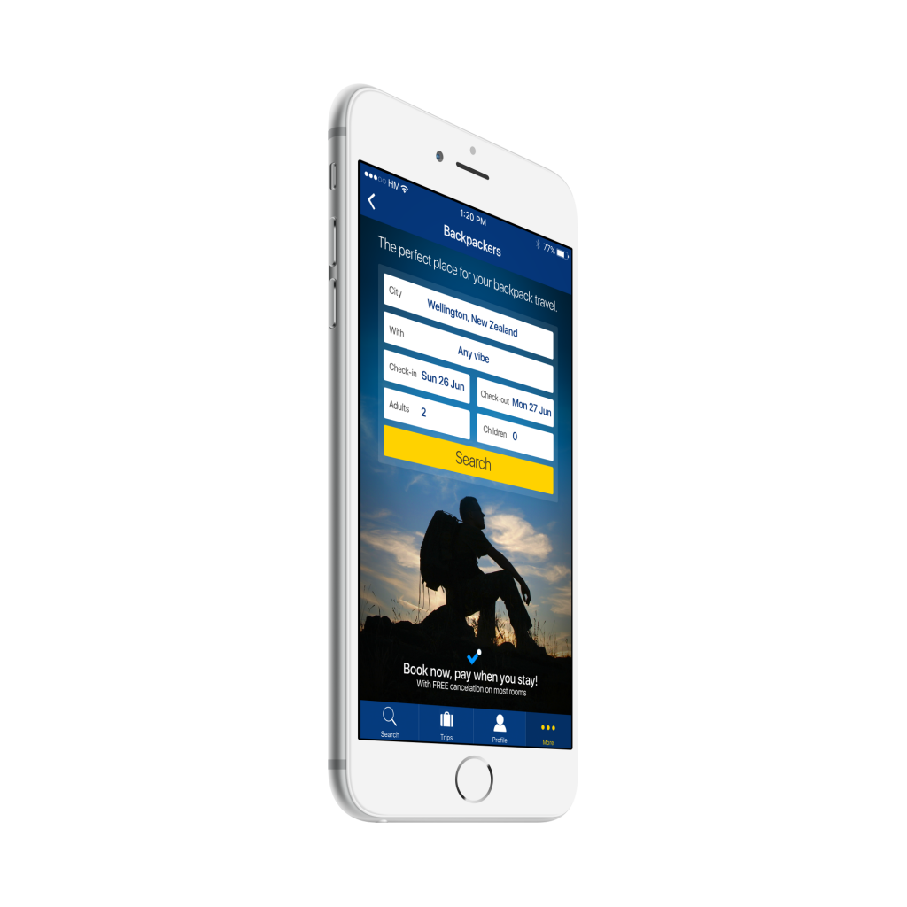
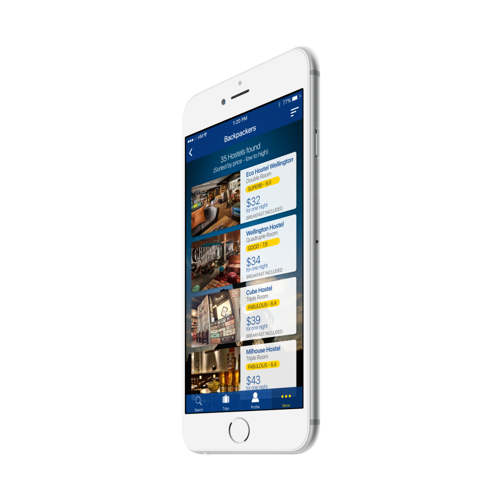
Booking Backpackers
This is an add-on to the booking app (or maybe a new app in the future). I know many people who want to do low cost trips and when I was using Booking I always receive offers from hostels first… So why not create an area that takes care of this kind of users and show them what they are searching? The focus here is show properties sorted by prices in a simply lower to higher scale. I used the design created for the secret deals to create a visual unity in these items of the more tab bar. This new area can create a new channel to this kind of users and increase the conversions.