In this product, we wanted to create the best experience possible to sell British Gas Home Insurance, but how to stand out in the crowd? How to compete with price comparison websites (or how to win inside them)? How to win in a saturated market where the price is one of the most important things to our customers?
I worked along with another UX Designer, Oliver Borders, for the first five months on this product but he left the team one month prior to our launch date. I have worked as a UX Designer in this project, helping also as a BA and other roles in the team when needed.
Following the launch date, I started to work with the data gathered using Adobe Analytics to monitor our funnel conversion and some other specific data, Decibel Insight to watch real live customers on our product and also I ran some user testing sessions to validate hypothesis and answer questions to help Stakeholders on our business team.
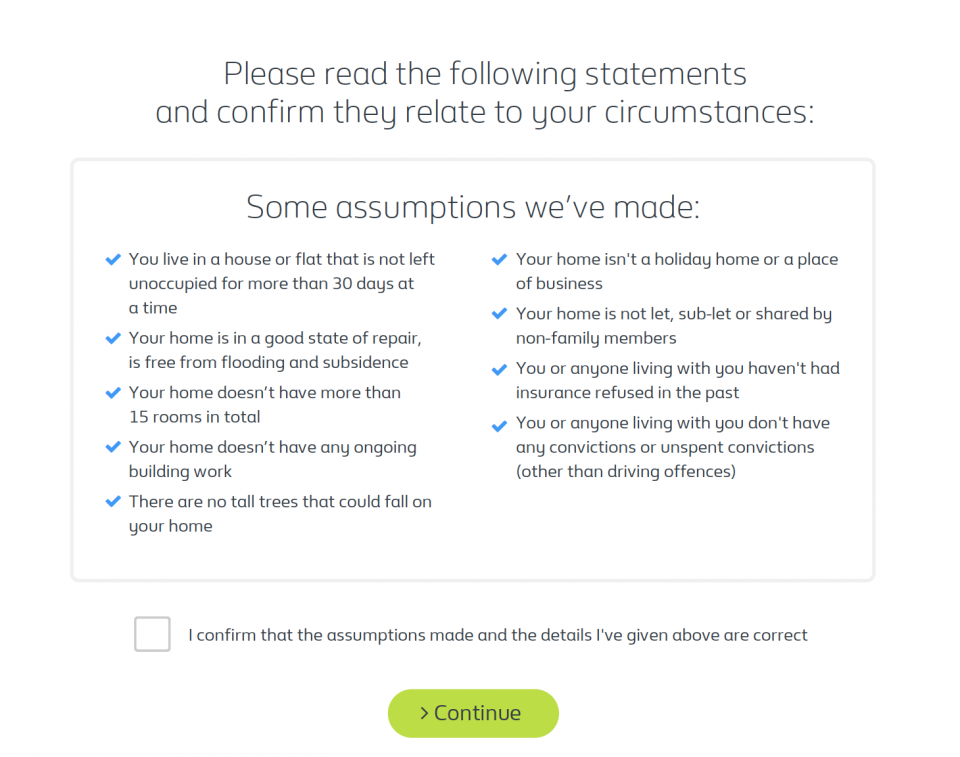
Old version – Users have tried to click on the blue ticks to adjust the assumptions to their reality.
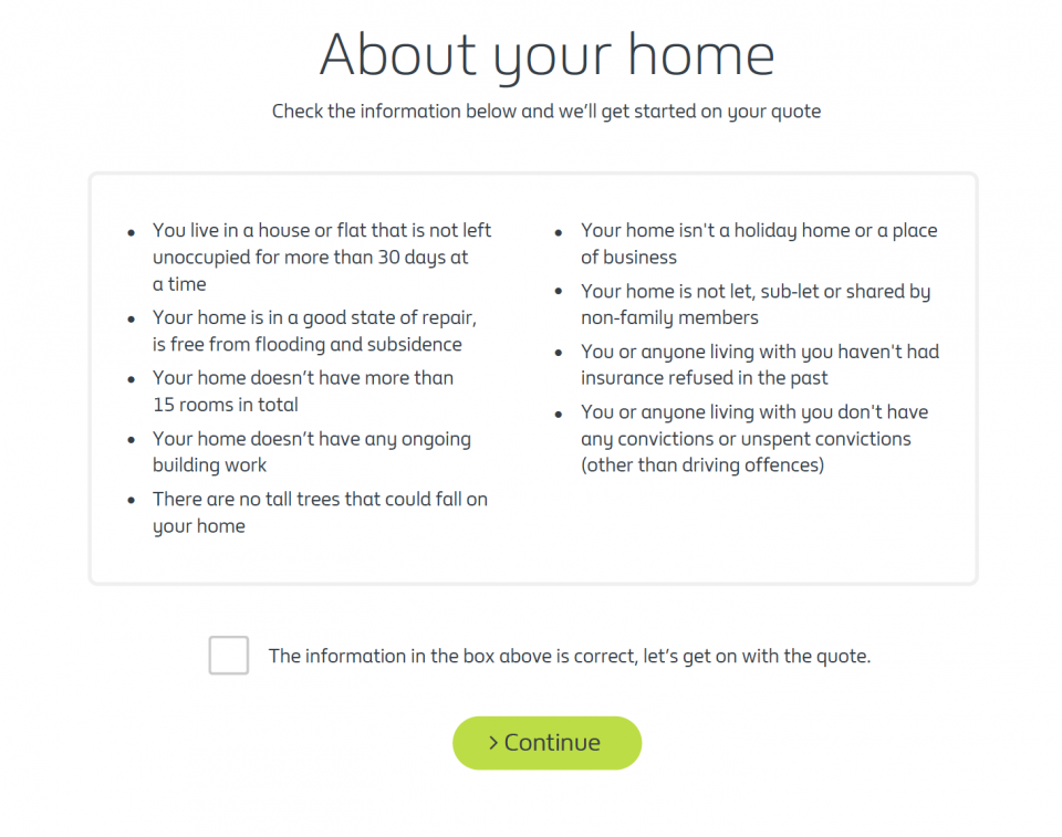
New version – Better copy and the removal of the tick mark.
Some good examples of improvements done in this journey are two problems that never happened on the user testing lab but were happening on live (using Decibel Insight), where users were clicking over the assumptions (the common British Gas component to assumptions has tick marks) to adapt the list to their reality and another component that used to show blue colour over the content that you typed in the form, and users were clicking out of the fields expecting to have that selected. Both adjustments helped users to go through the journey and reduced friction.
User testing sessions were useful to prove us right in some hypotheses but also were able to prove us wrong about things like drastically reducing the number of questions in an insurance journey, makes the users think that the final price won’t reflect their reality.
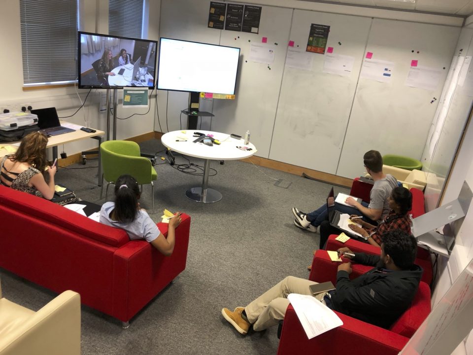
User Testing – Observation Room
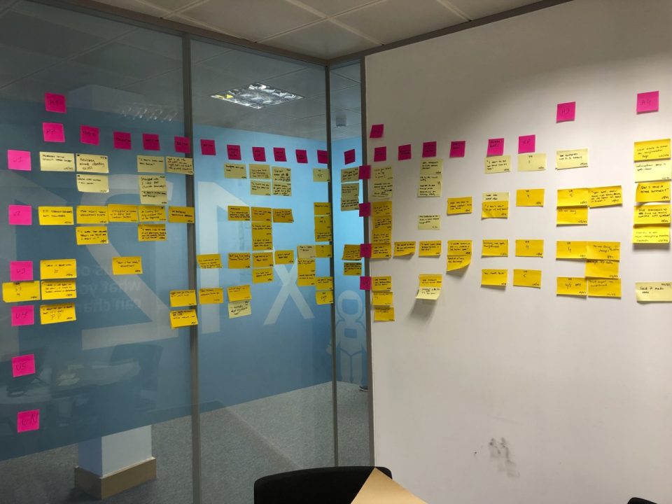
User Testing – Wall of observation
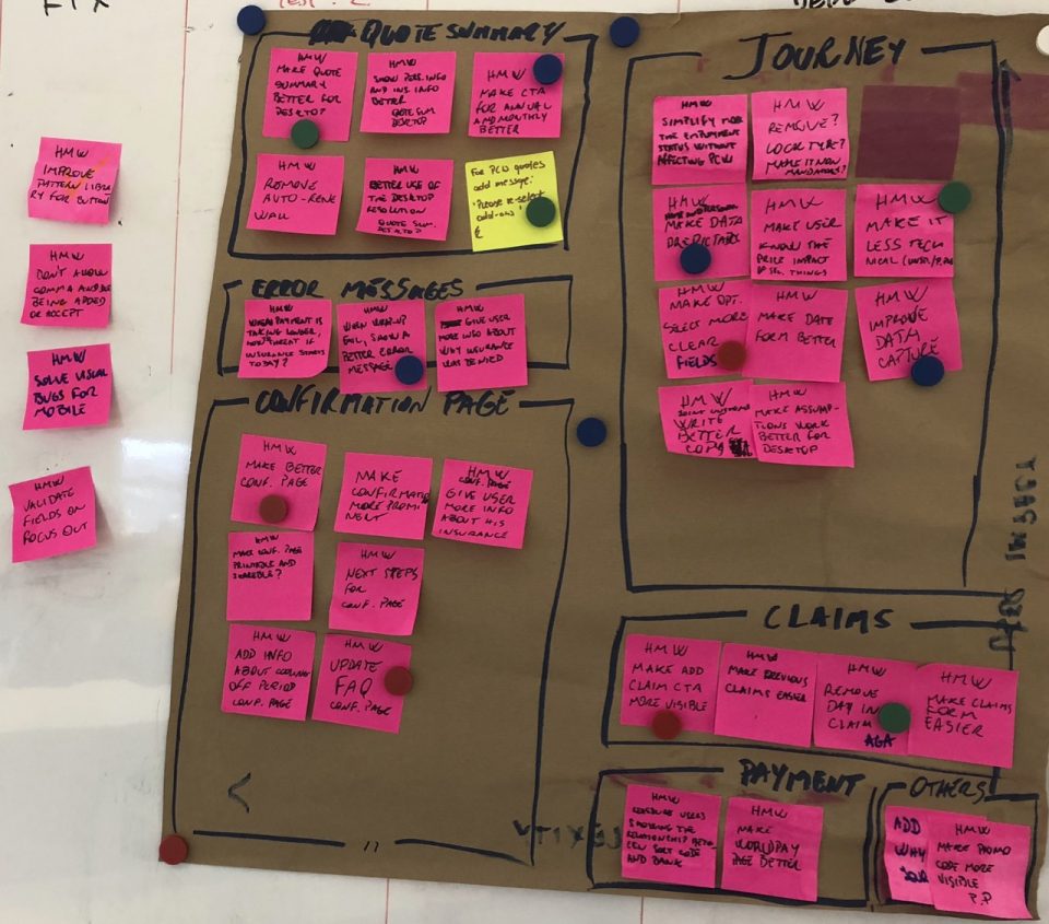
User testing – List of actions (How might we)
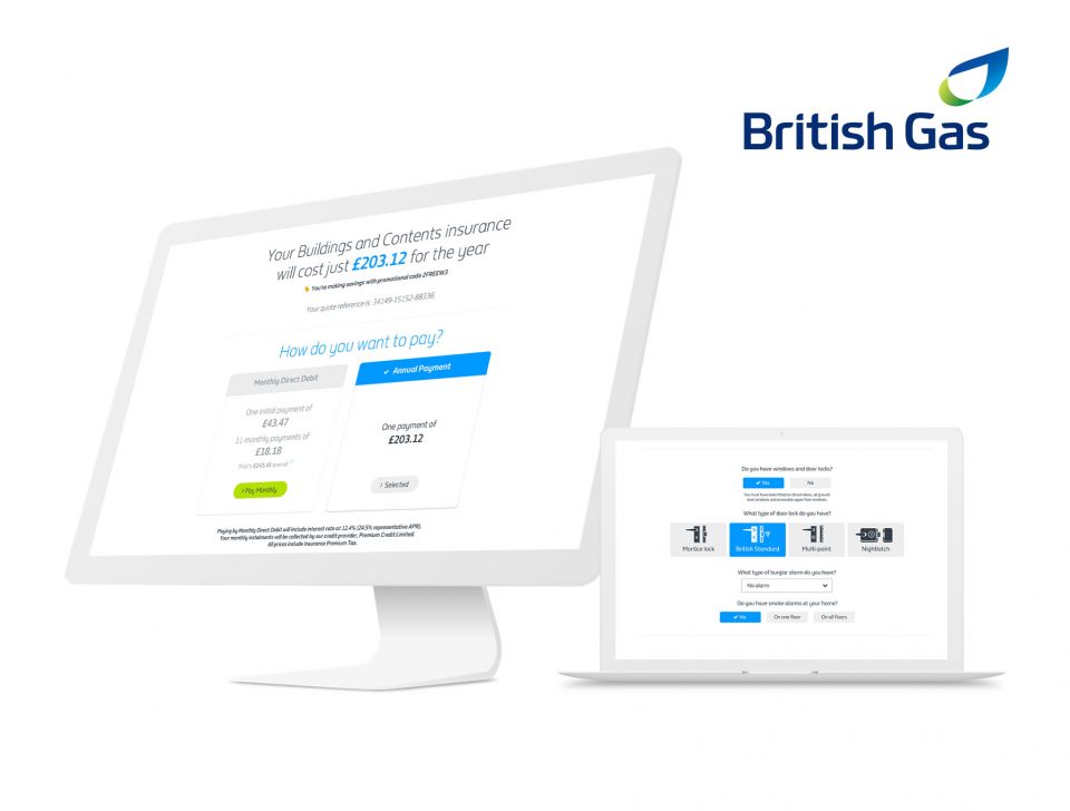
The second version of the quote summary page was also improved after a user testing session, and with that second iteration we were able to increase the conversion in more than 10% when compared with the previous one, plus increasing the number of extras selected in more than 20% by our customers. I also worked in adjustments that allowed the product to be cheaper to users, allowing them to select specific scenarios like the amount paid for unspecified items in your insurance instead of selling a non-practical package on their policy.
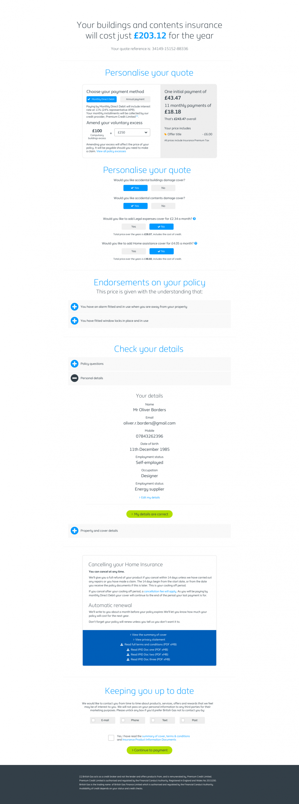
Quote Summary Page – Version 1
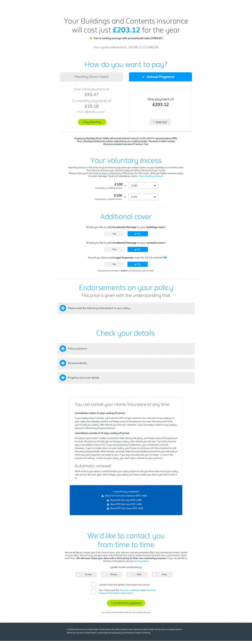
Quote summary page – Version 2 Improved conversion and extras selected
Regarding the outcomes, this product achieved in five months the sales expectations for the year. Conversion overall is X3 compared to the old model. The first iteration was able to match the expectations from the business, but the second iteration was able to increase near to 20% the conversion rate.
My team was composed of a Scrum Master, a PO, two frontend devs, one backend dev, two testers, one architect and an Insurance Director. I also had two copywriters and one data analytics person to help me.
You can find the live version here: https://www.britishgas.co.uk/home-services/home-insurance.html