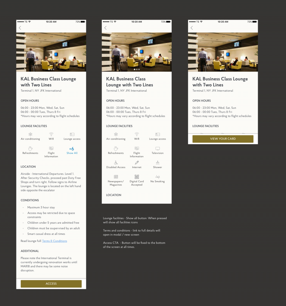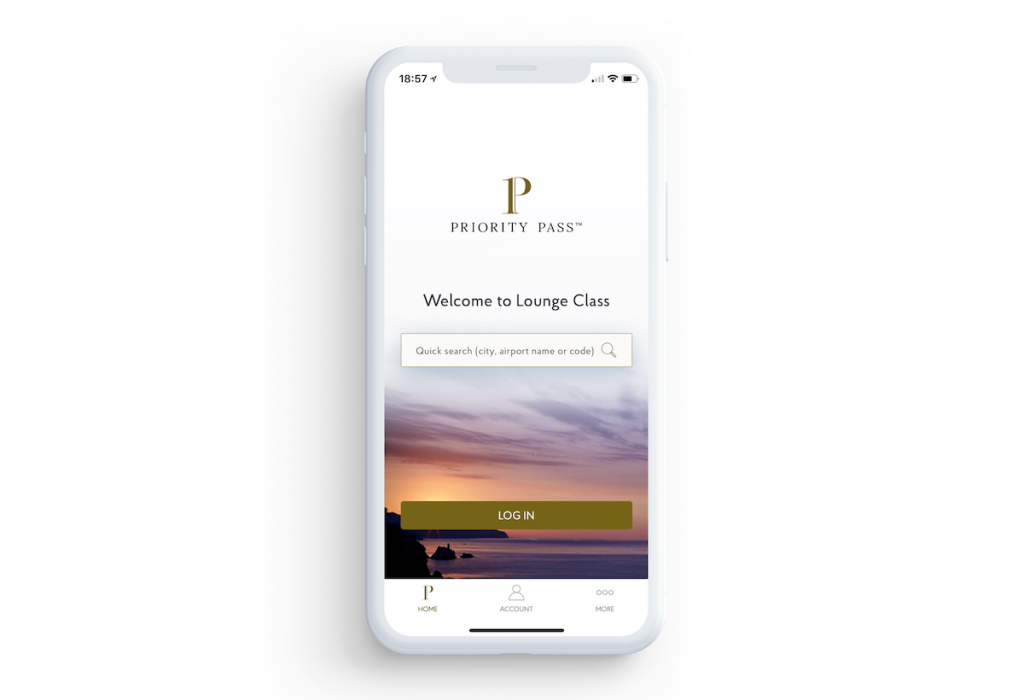
Priority Pass™ is the world’s largest independent airport lounge access program, providing members with quick and easy access to 1200+ airport lounges worldwide. With the free Priority Pass app, you can benefit from a host of additional features to make the airport experience more rewarding.
Priority Pass was my first big project when I arrive in London in 2017. The idea was to create an MVP to allow Priority Pass to have their own code base to keep improving the app in the future releases, so my goal was to create the best experience possible for their customers, trying to match the old app specifications, allowing users to book lounge access and to digitally use their Priority Pass card.
Our team started a discovery process which took forty days, focused on the success factors, their goals, signals, and metrics. I also conducted the user research, user interviews, a Chinese market research to allow the client to take their directions to that market. I also worked on competitor research and the customer journey.
We conducted a feature prioritization that gave us the product backlog for the MVP with the client team, which was composed by their Product Owner, Business Analyst, UX Lead and Tech Lead.
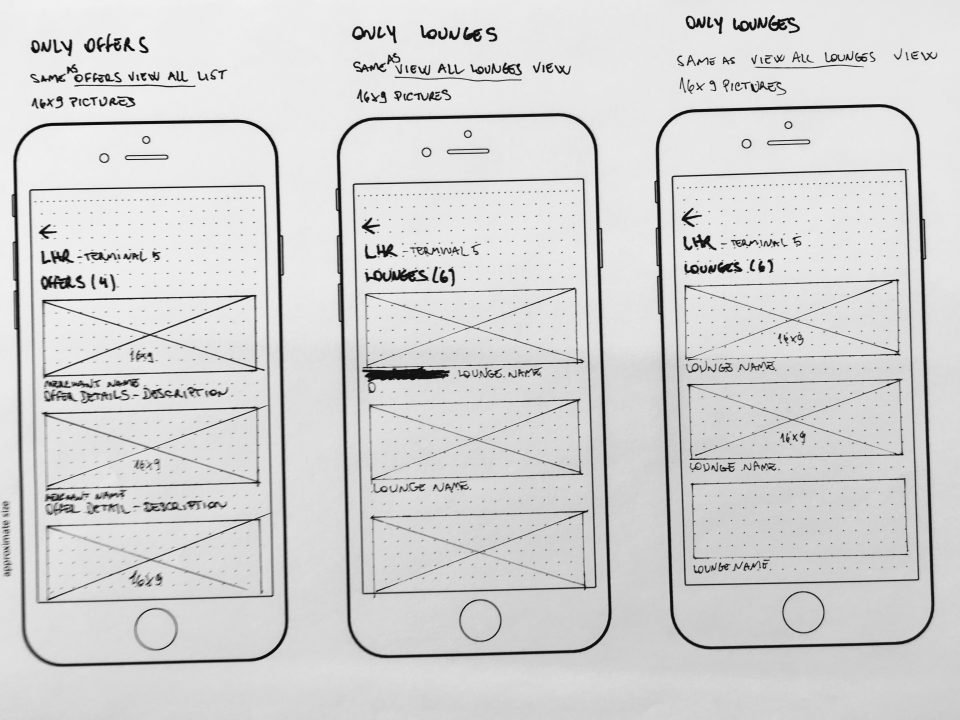
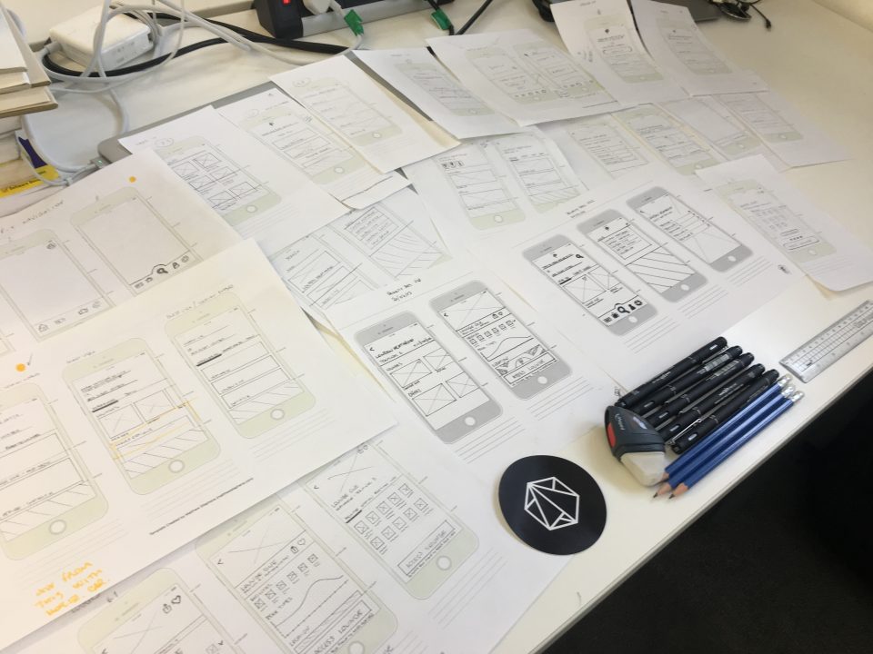
After this discovery process, I started to work in the user journeys for each of the features and worked on the simplification of the five most common user pain points. With that done, I started the first sketches of the new app user experience.

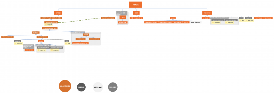
I conducted guerrilla tests with the paper prototypes to validate my hypothesis, which allowed us to choose the best approach over all the options that I’ve done. After defining the usability of the app, I refined the wireframes and created the IA to help and guide the development team.
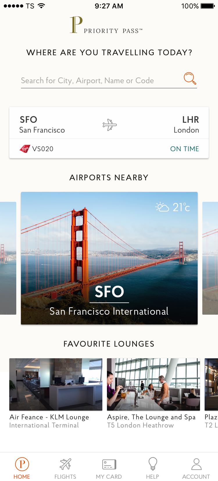
I worked in the UI in this project in the beginning, but after we had a UI designer added on our team that helped me to cross the line with my tasks, keeping my focus only in the user and client needs.
