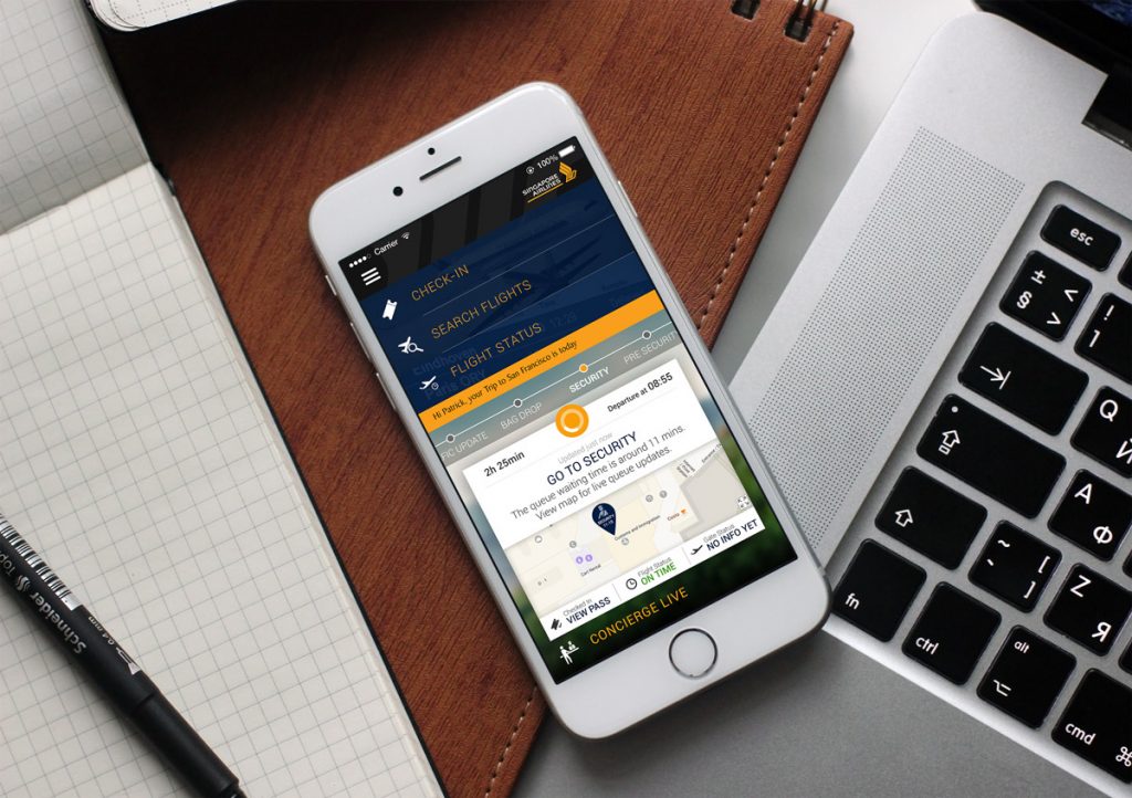
This is a concept that I made for the MTT, a company based Ireland focused in Mobile Travel Tecnology, trying to integrate the Concierge Live product into the existing Singapore Airlines mobile App.
ORIGINAL APP
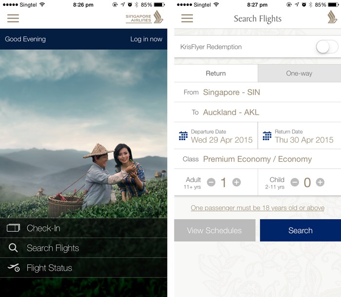
In this task I was asked to show my view about the user interface, user experience and as a creative digital designer. My mission can be resumed as adding another item in the home of the app (the Concierge Live), redesign the user interface using my skills and what I learned in my researches in the competitors, integrate the Concierge Live items in the app and show the micro ui interactions in a presentation video.
I did some improvements in the UX of the original app but I have tried to maintain the user memories because I believe this app is very good, and adding the Accordion in my point of view will improve the usability without redesign the entire app. Accordions are more experiential – you can animate the transition between the slides easily, it’s fun and it makes sense but I know that accordions are not a native solution, but I believe that is the best solution for this situation. As you can see in the original app, the most important items in the index page were all in horizontal lines and when the user tap in one of them the others are complete hidden and if you want to return to home or go to other of this main items you need to use the menu icon and then tap into your desired item. So you have two different styles of navigation in the same app – you can use the items on the index page or in the side menu.
ORIGINAL CONCIERGE LIVE CARDS
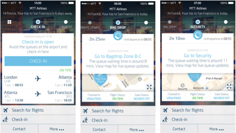
My redesign proposal is an evolution of the original app based in three points:
• I am not trying to reinvent the Wheel – I am adding a new feature and making adaptations to make everything easy to our users when they are using the Concierge Live cards;
• The client design guideline;
• I’m trying to create a more fluid home screen.
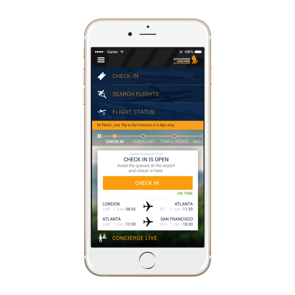
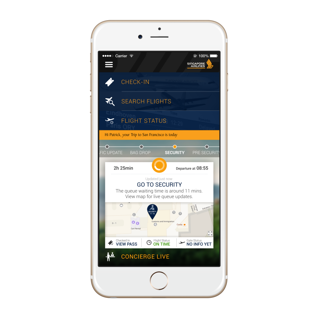
Using the Accordion, I am allowing the user to switch between the most important items with more speed and with secondary options in the side menu as is the original design. Besides that the cards looks more integrated in the design. The original idea of using a timeline in the top, showing like a breadcrumbs of the user evolution is great and I just applied in the top of the accordion item, not at the top of the app.
MY REDESIGN PROPOSAL:
Home
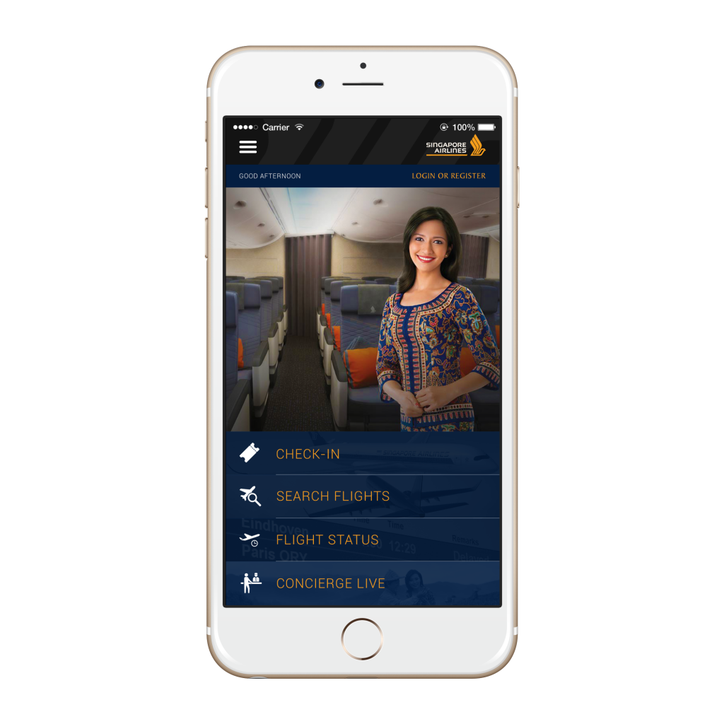
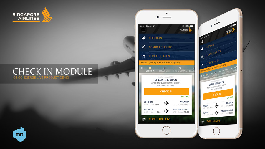
Concierge Live – Check-In Card
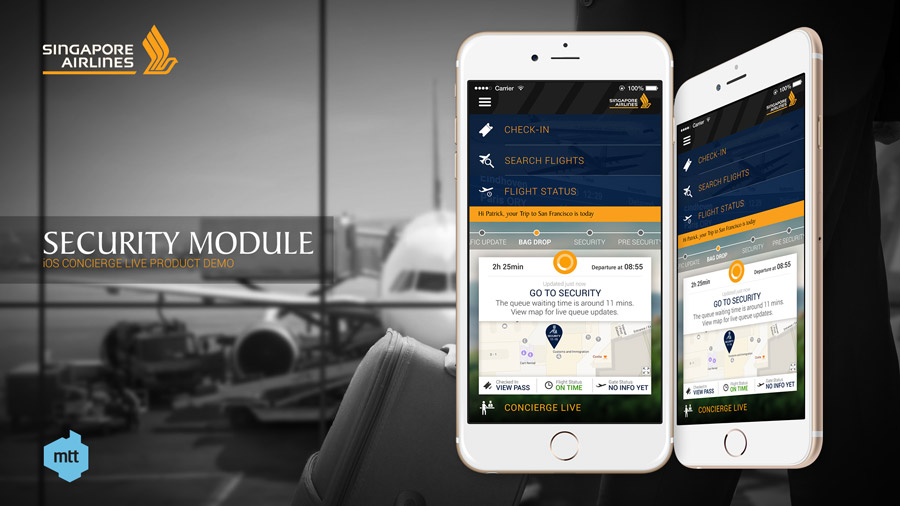
Concierge Live – Security Card
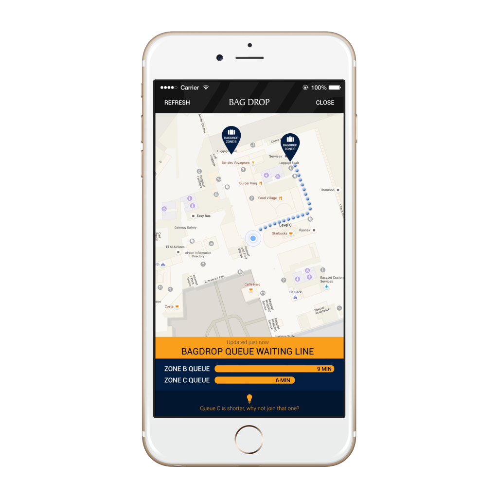
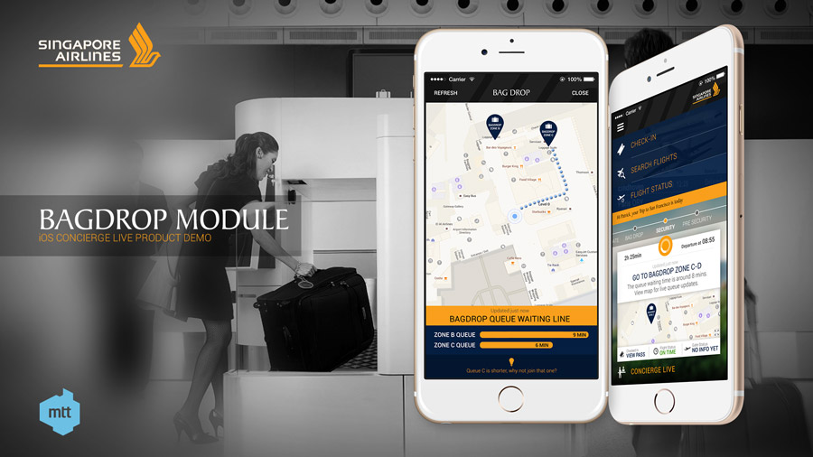
Concierge Live – Bag Drop Map
Loading Screen
APP PRESENTATION:

MICRO UI INTERACTIONS AND APP USABILITY WITH ACCORDION
https://youtu.be/EN0vYbHIK5E
I did this concept in one day of research and thinking and another two days of hard work in Photoshop/After Effects.