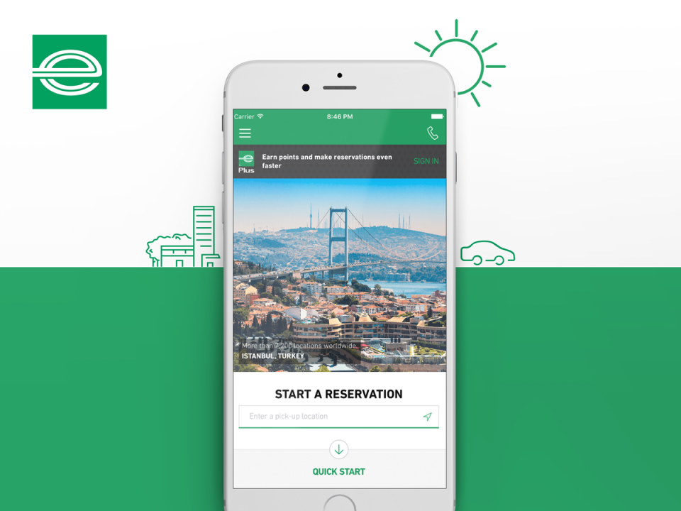
Enterprise is a rental car company and one of the five hundred biggest companies in the US and the world leader in rental car service.
I was the Lead Experience Design being responsible for doing UX and Visual Design for web and app in a team with other 2 UX Designers and 2 Visual designers.
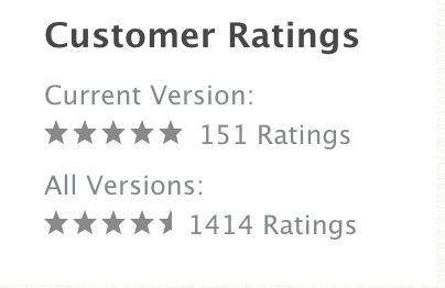
This app was my first five-star app in the Apple Store, with 151 ratings in the updated version, which was an increase of 0.6 on the previous version. But the biggest thing about it is the user’s comments.
SO convenient!
by AnnliarubioI rent cars fairly frequently (about twice a month) for business and to visit family a few states away. I was reluctant to install the app because don’t like to install apps I don’t use on the daily. Finally, I decided to try it. It is AMAZING. So convenient and easy. I can literally reserve a car in under a minute. I highly recommend this app.
How every app should work
by MGM in TeeIt’s a perfectly linear flow to get you from A to B. It’s not like other car companies that entice you with a low price and then they surprise you by doubling the price with fees on checkout. The transparency is refreshing. Enterprise seems to do a lot of things better than the rest of the American car rental companies.
So far, nothing but smiles
by Pop GigThis app is just really well done. It’s good looking, updates quickly, and the UX is simple and easy to navigate. Thank you Enterprise, it’s great to see a company take pride in designing an app that customers will actually want to use vs. other companies who just build something that makes sense to them internally.
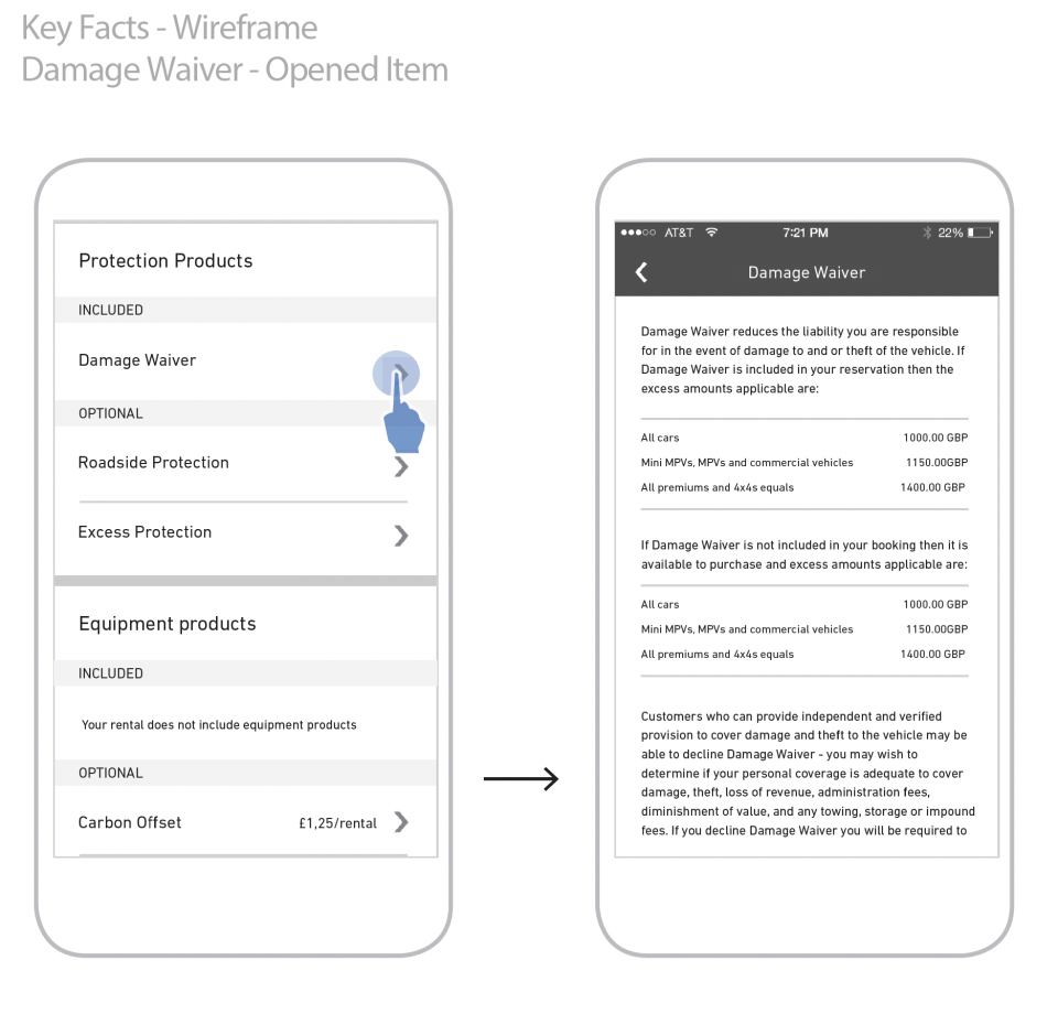
I had three major tasks in the six months that I have been with the team, which were to create the new Enterprise Rewards program, to reduce the calls to the customer service creating a better solution for the ‘Key Facts About Your Rental’ and to update the app to match the changes made and tested on the website.
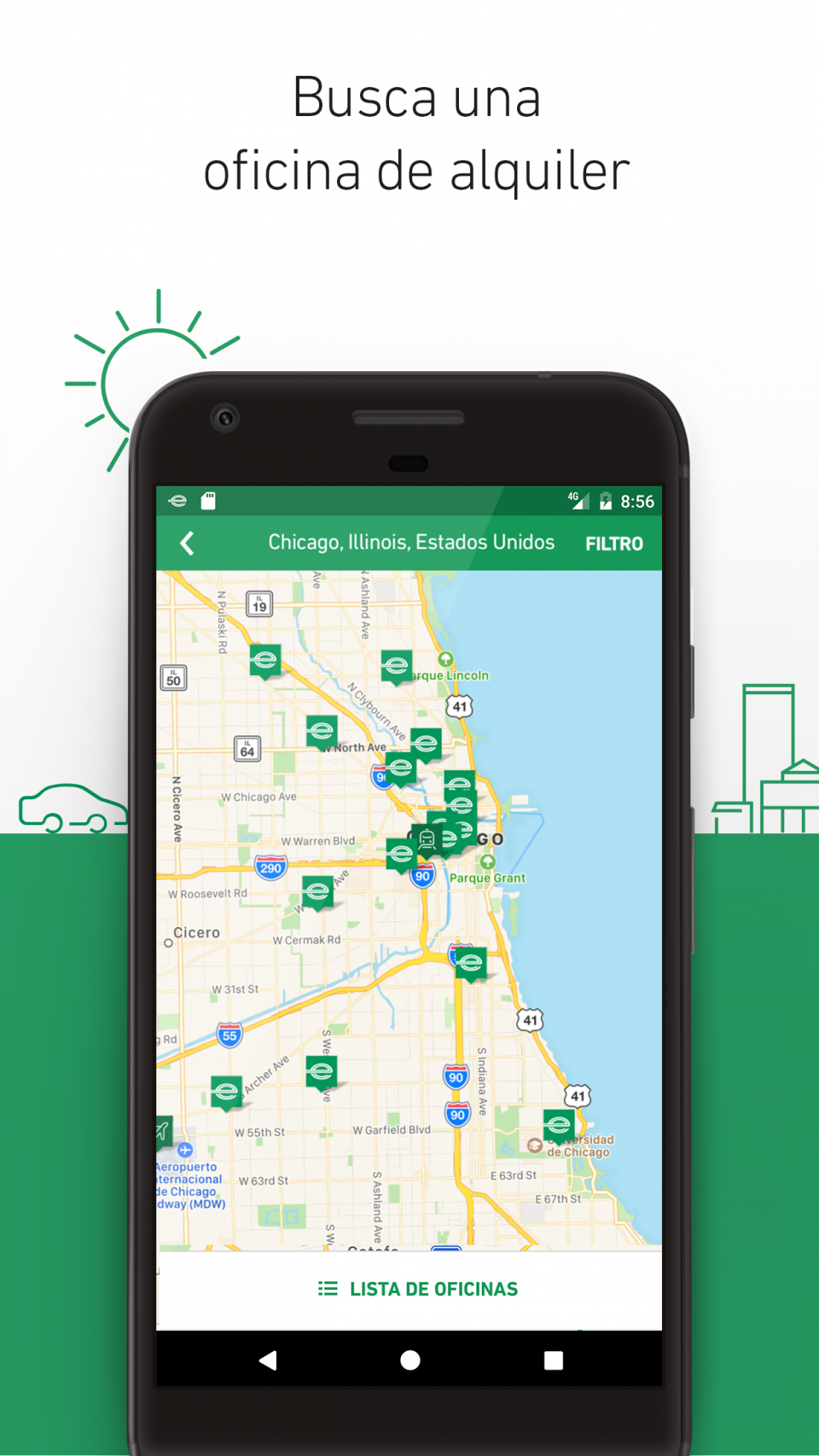
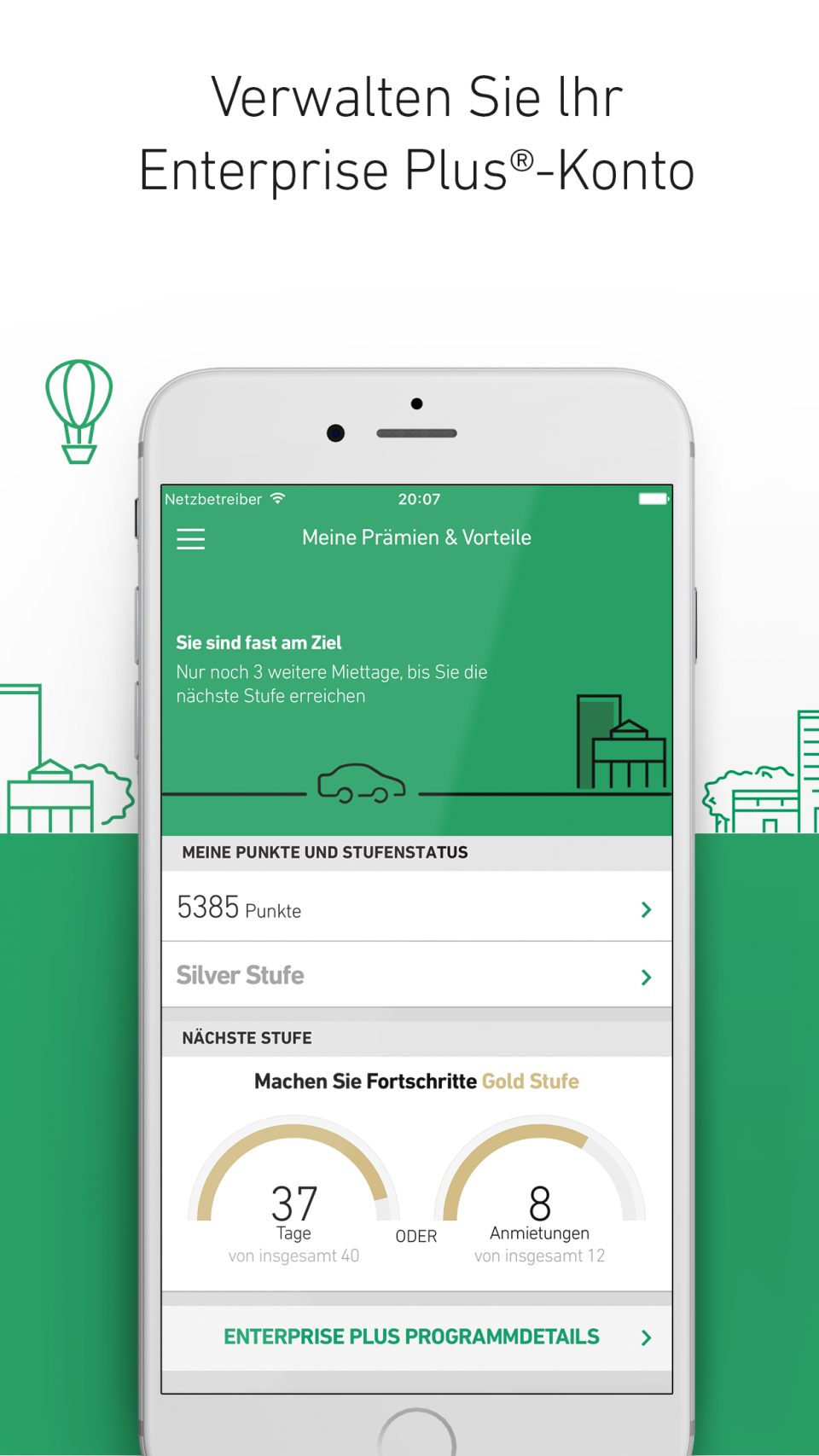

Enterprise Plus Loyalty – Unauthenticated view
